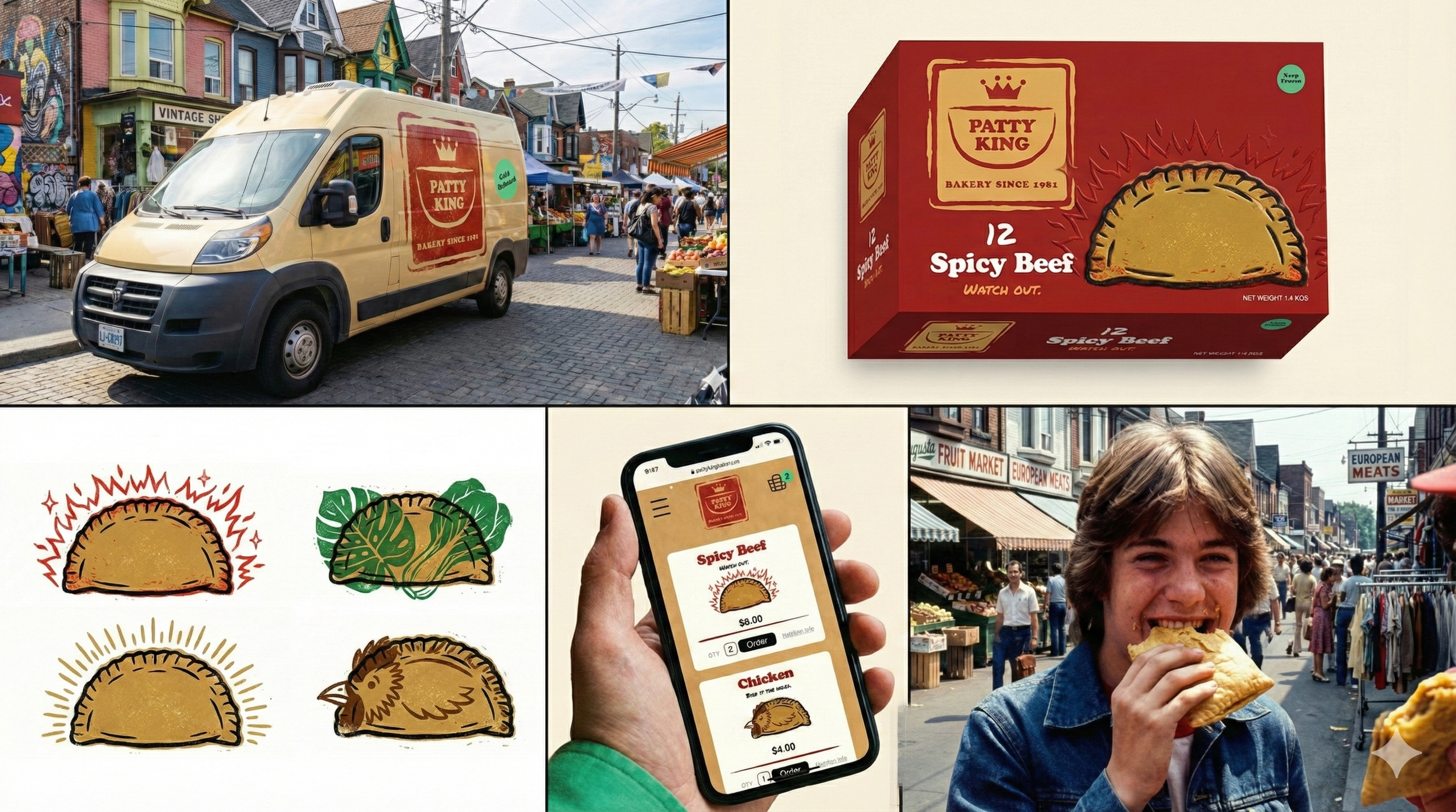
Patty King Bakery
Designing the 'Double Diaspora' Brand
Role: Brand Strategy, Creative Direction, Visual Identity & UI/UX.
The Mission: To differentiate a heritage brand from generic Caribbean tropes. The strategy dismantles stereotypes to build a visual language honoring the specific Chinese-Jamaican experience in Toronto, merging Eastern discipline with Jamaican soul.
The Vision: To elevate the humble patty into a symbol of "Imperial Heat." The new identity visualizes the "Double Diaspora" as a collision of worlds where the rigorous structure of the East meets the vibrant rhythm of the West, positioning Patty King not just as a bakery, but as a cultural institution of Kensington Market, Toronto.
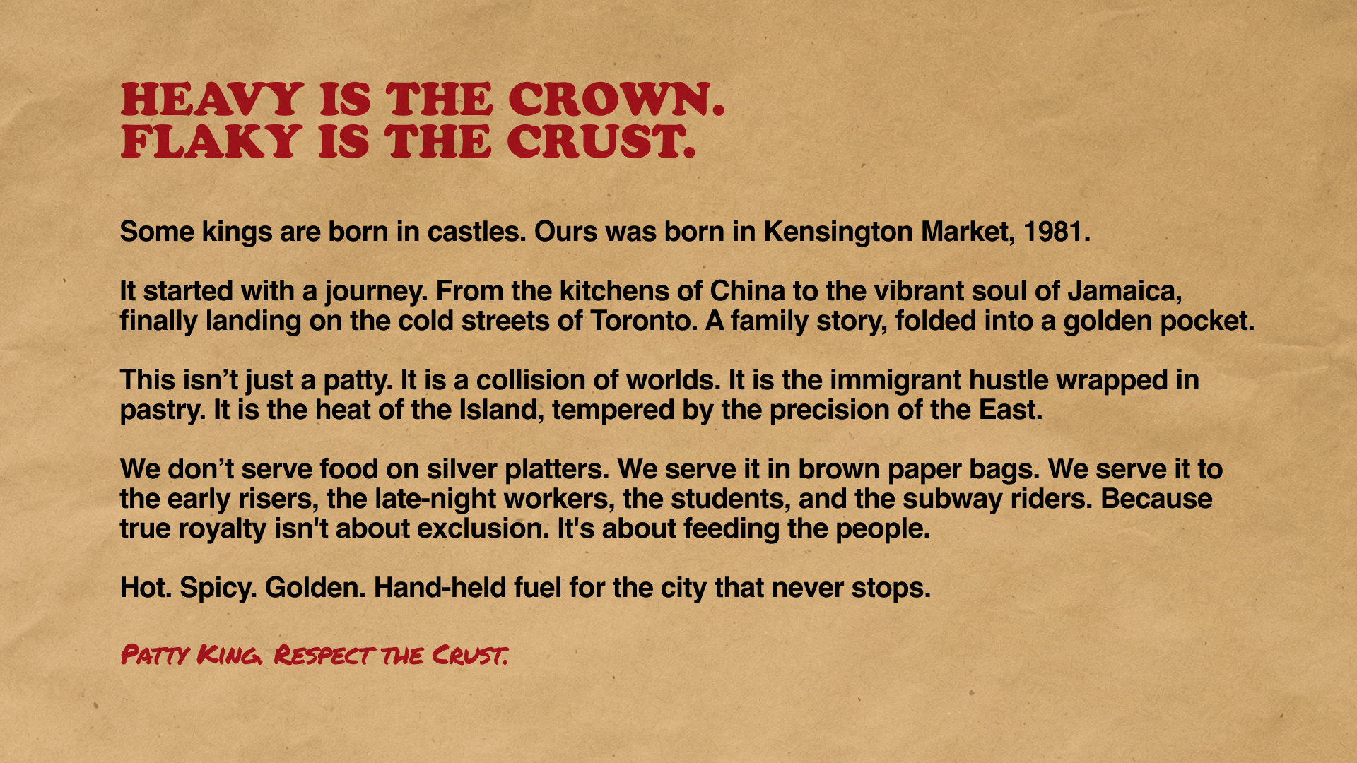
A heritage brand needs a voice, not just a slogan. We moved away from corporate mission statements to a "Street Manifesto." By declaring "Some Kings are born in castles. Ours started in Kensington," we ground the brand in a specific location and a "working-class royalty" narrative that resonates with the target demographic’s appreciation for grit and authenticity.
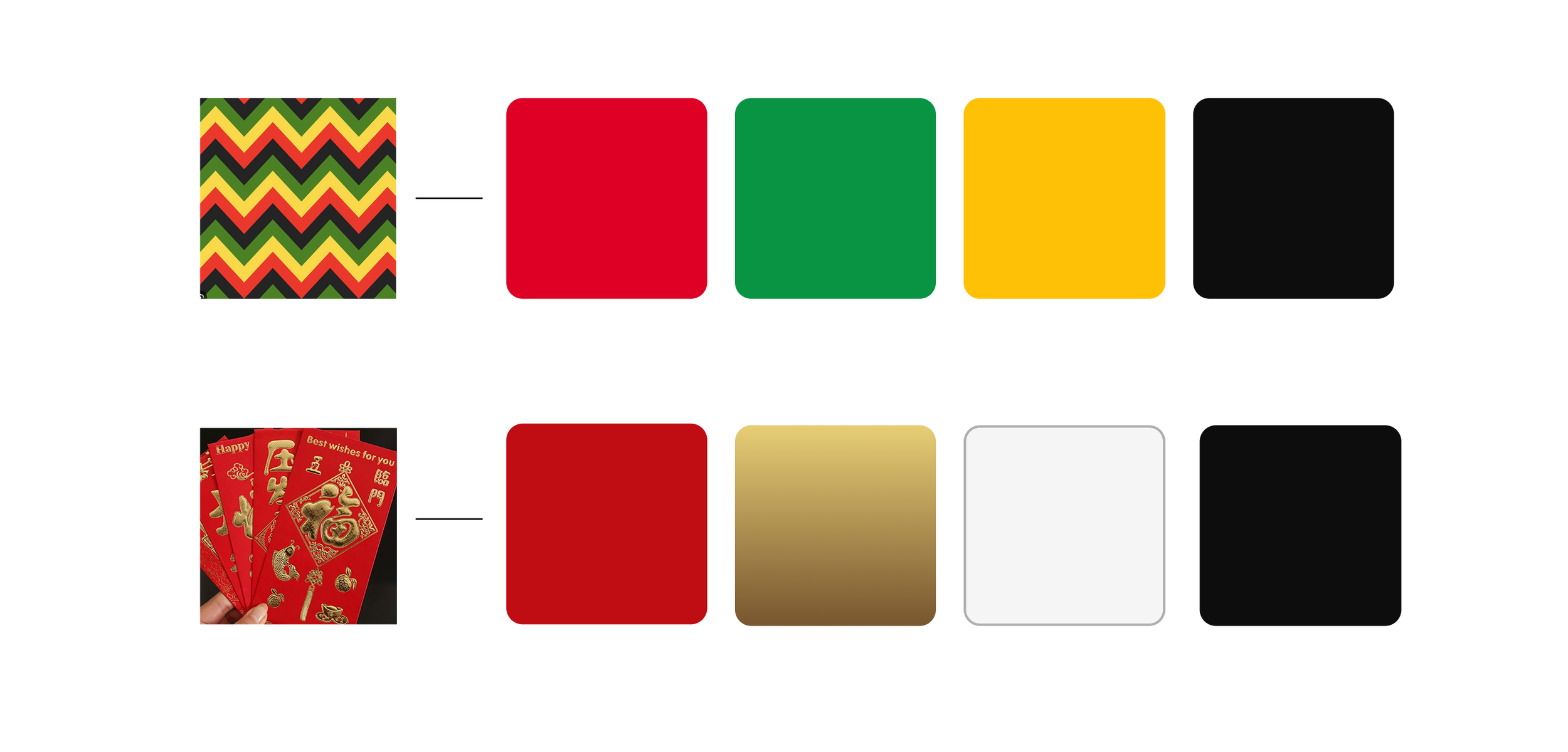
Disrupting category codes without alienating the consumer. I analyzed traditional Chinese Red Envelopes alongside Jamaican textile patterns to find the "Double Diaspora" overlap. The strategic goal was to avoid the generic "Rasta" tricolor (Red/Gold/Green) used by every competitor, creating a proprietary palette that feels familiar yet distinct on the shelf.
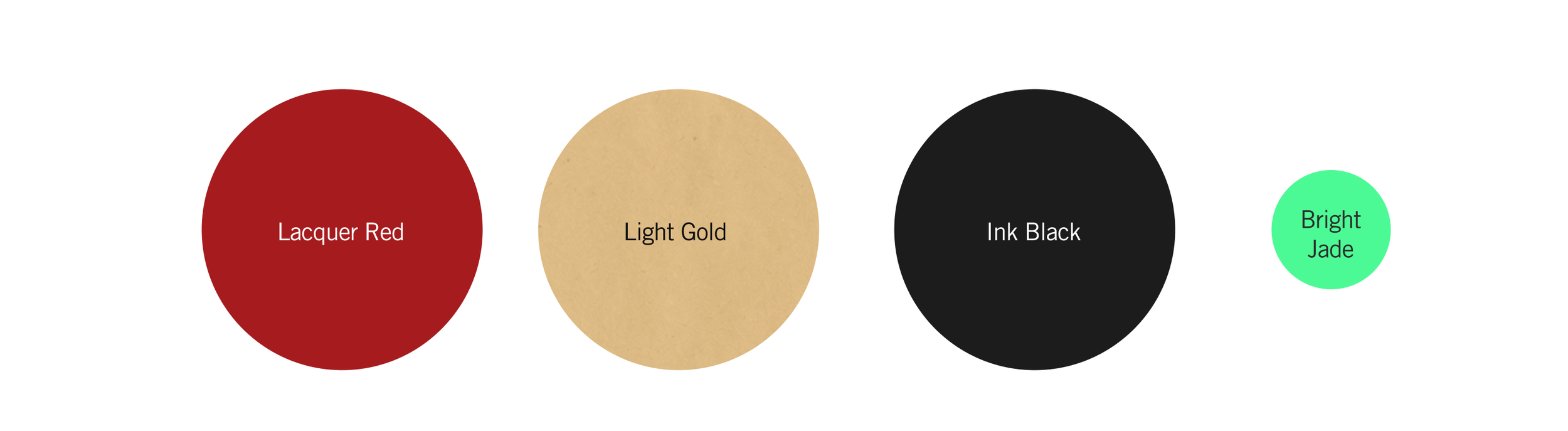
Color psychology as a premium signal. The selected code drives specific emotional responses: Lacquered Red (Chinese Prosperity/Appetite), Light Gold (The Product/Royalty), Midnight Black (The Street/Ink), and Bright Jade (Protection/Freshness). This combination elevates the brand from "cheap snack" to "cultural treasure."
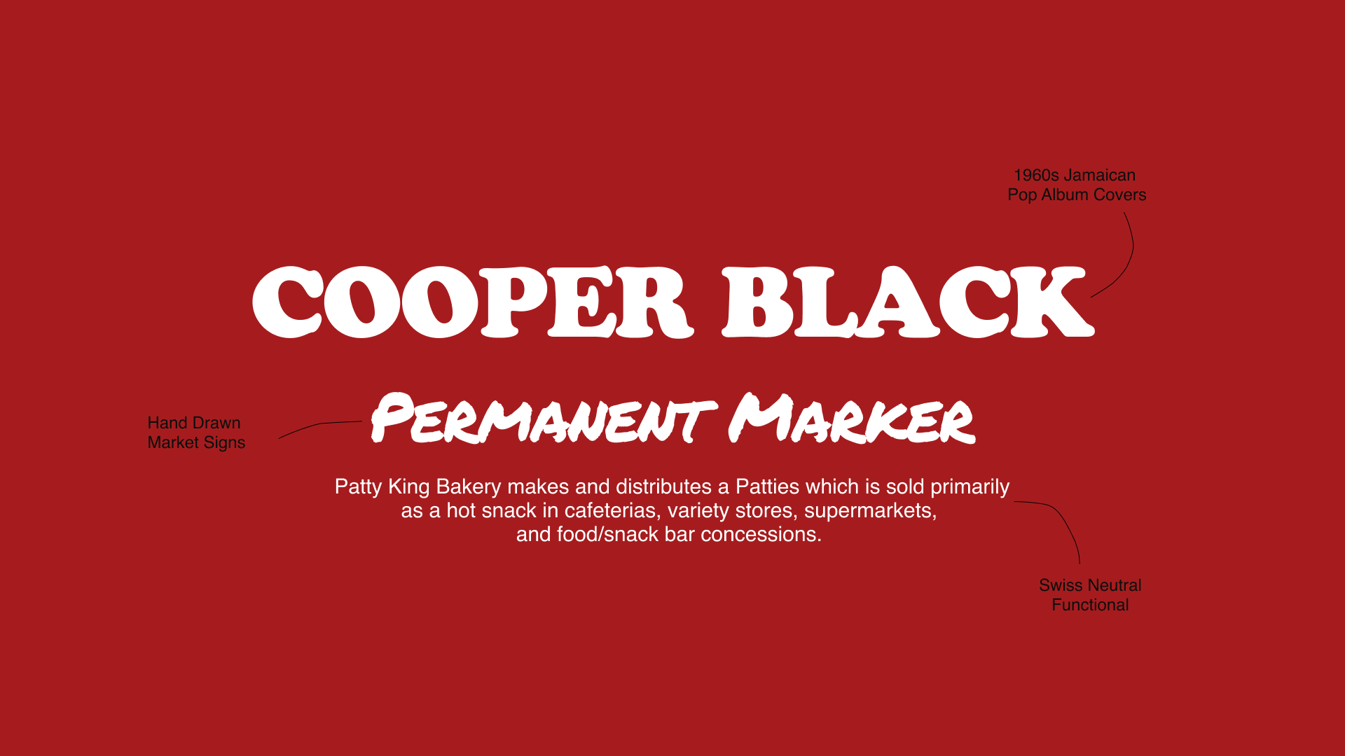
The typography balances two distinct brand voices. Cooper Black (referencing 1960s Jamaican vinyl covers) a 1980s classic provides the soulful, nostalgic "bassline," while a hand-drawn Permanent Marker font acts as the "hustle"—the immediate, human voice of the market stall that creates urgency and intimacy.
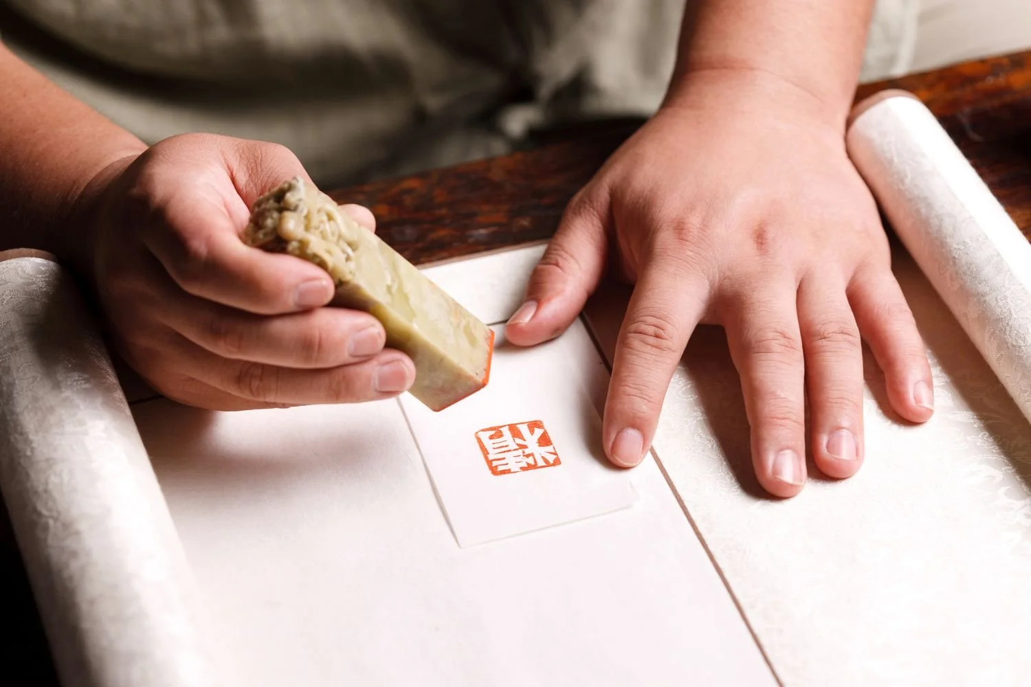
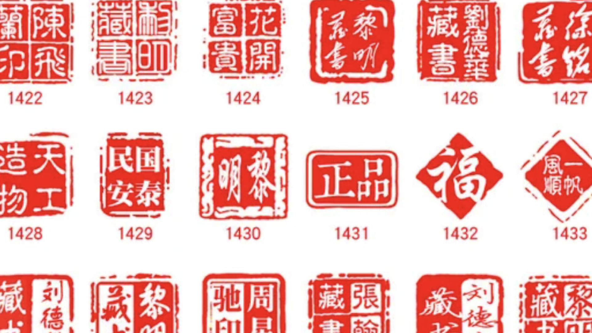
Leveraging ancient symbols of trust. We replaced generic bakery clipart with a customized Chinese Chop (Seal). In CPG, trust is currency. The red stamp visually certifies every product with a mark of ownership, craftsmanship, and lineage, signaling "Handmade" in a market flooded with industrial products.
Optimized for both physical stamping and digital overlay. The Chop system is adaptive: solid red for physical packaging stamps (mimicking ink absorption) and outlined versions for digital content. This ensures the brand retains its "lo-fi" texture even in high-fidelity digital environments.
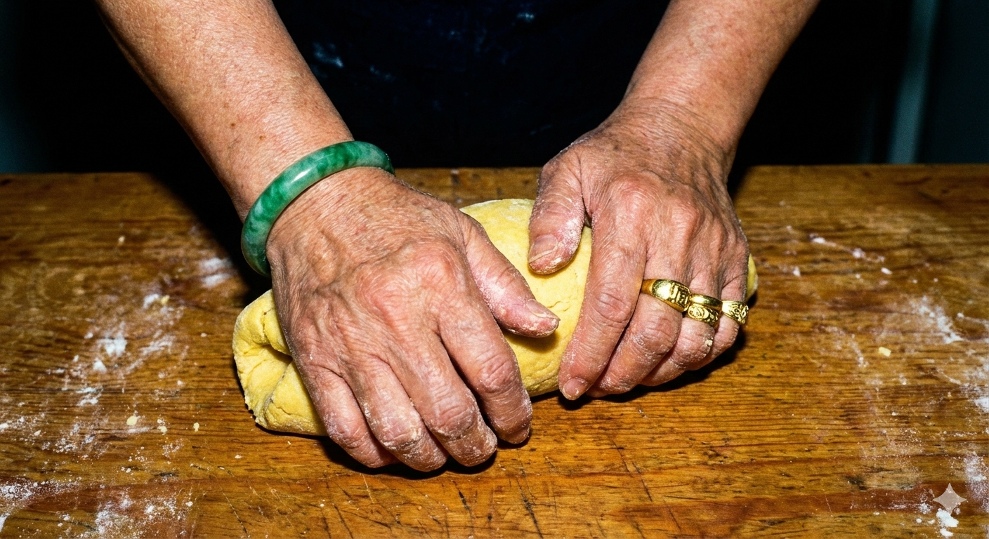
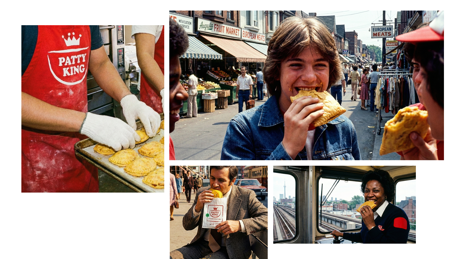
Storytelling through somatic details, not just faces. We styled "The Matriarch" to narrate the brand’s history without words. The Jade Bangle on the left hand signals Chinese lineage and protection, while the Gold Rings on the right signal Jamaican flair and status. It visualizes the "hands that built the business," adding a human element that mass-produced competitors cannot claim.
Using "Somatic Heat" to trigger appetite appeal. We rejected sterile digital photography for the aesthetic of Ektachrome film. This stock’s high saturation of reds and golds captures the temperature of the bakery. It signals "We have been here for 40 years" (Heritage) and makes the product look physically hot (Sensory), driving immediate craving.
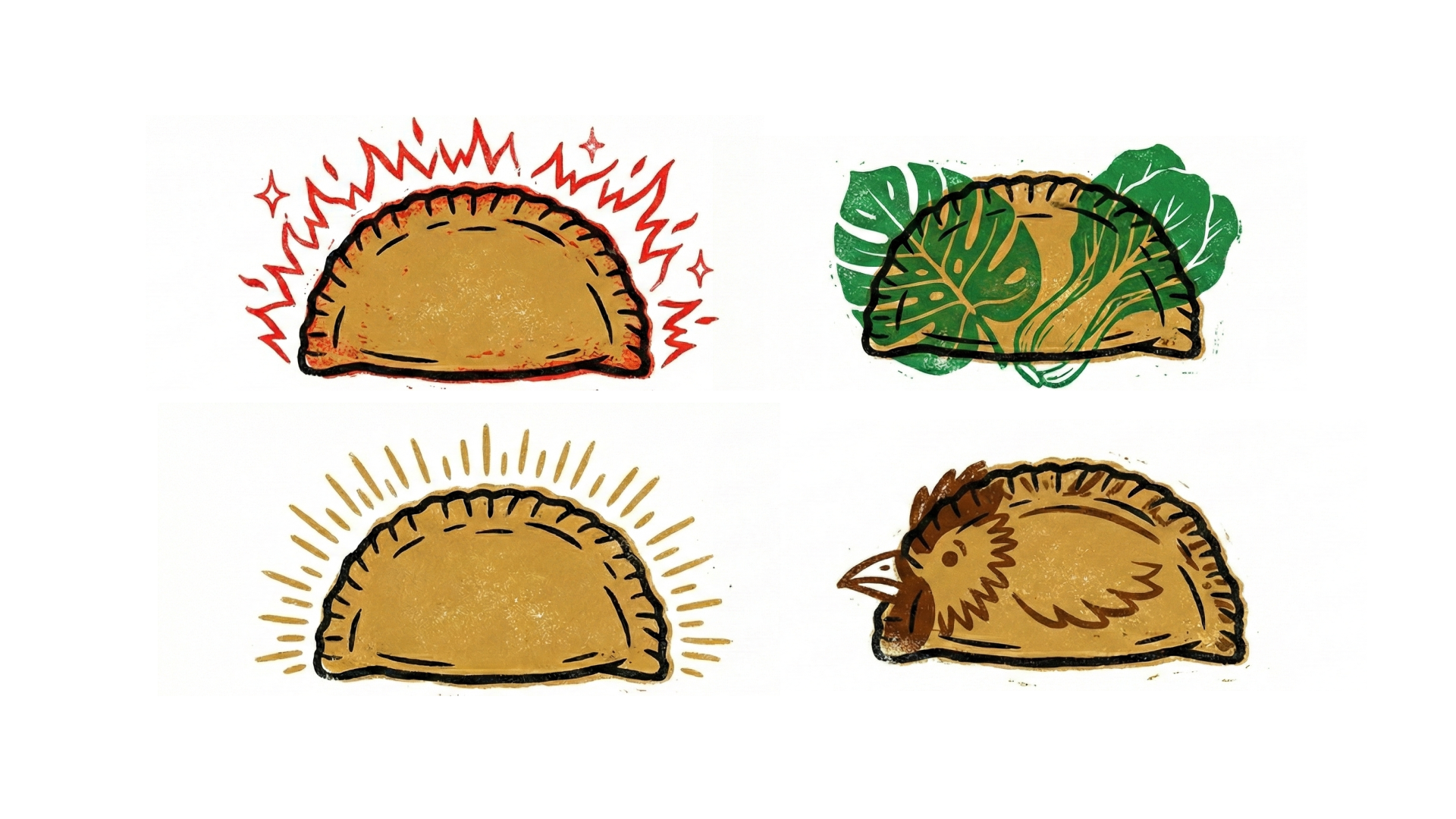
Navigational clarity through "Vibrating" Energy. The flavor icons use a misaligned screen-print technique to mimic the energy of street art. Beyond aesthetics, they serve a strict CPG function: clear visual navigation.
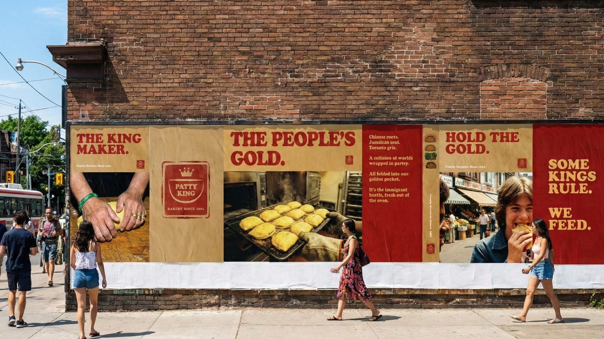
Turning construction hoarding into brand equity. We turned the street itself into a gallery. This "Wild Posting" strategy reinforces the brand's ownership of the Toronto Market, proving that this brand lives on the street, not just in a boardroom.
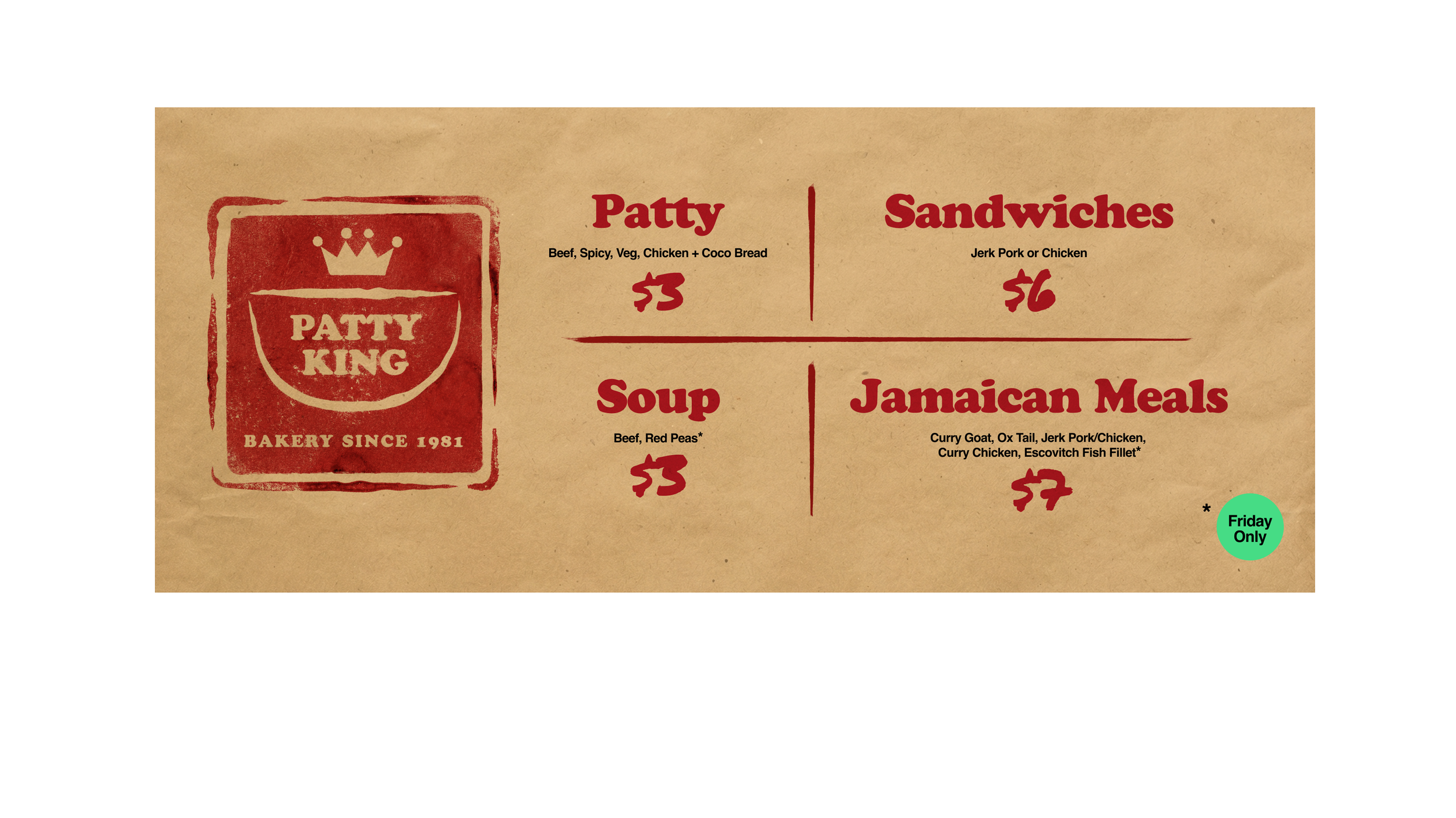
Using layout to influence purchasing behavior. The menu utilizes the "Iron Lattice" grid structure to organize information density. We employed a Jade Dot as a "scarcity signal" to call out limited-run "Friday Only" specials, leveraging the cultural value of Jade to drive demand for higher-margin items.
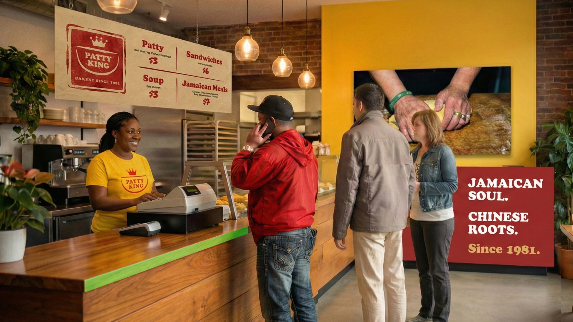
The "Nudge" Line. The interior reflects the brand's dual soul. The counter features a Jade Green stripe—a subconscious visual cue indicating where to pay. The wall displays the "Double Diaspora" manifesto, turning the wait time into a brand education moment.
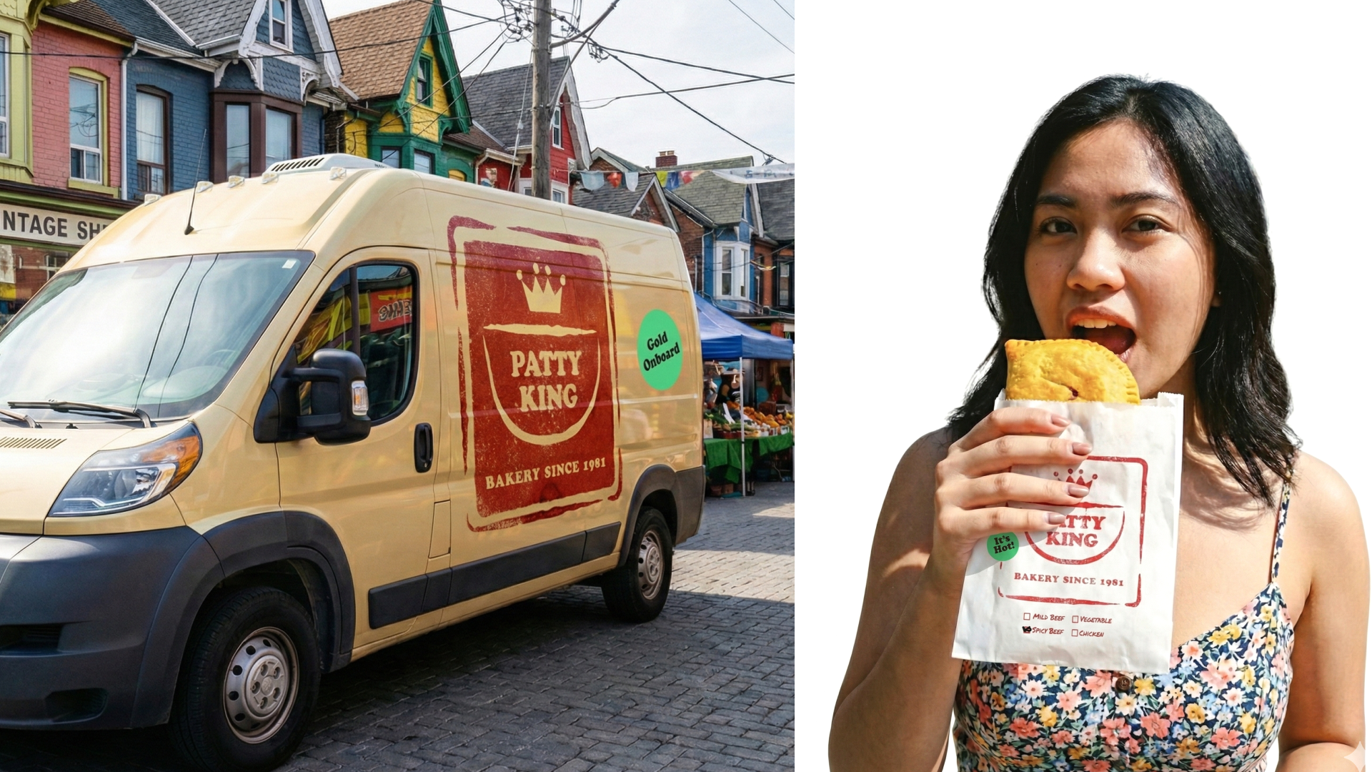
Packaging as mobile advertising. The greaseproof wrapper isn't just functional; it's a mobile billboard. The "Chop" logo, the wrapper turns every customer eating on the street into a brand ambassador, extending the brand's reach beyond the storefront.
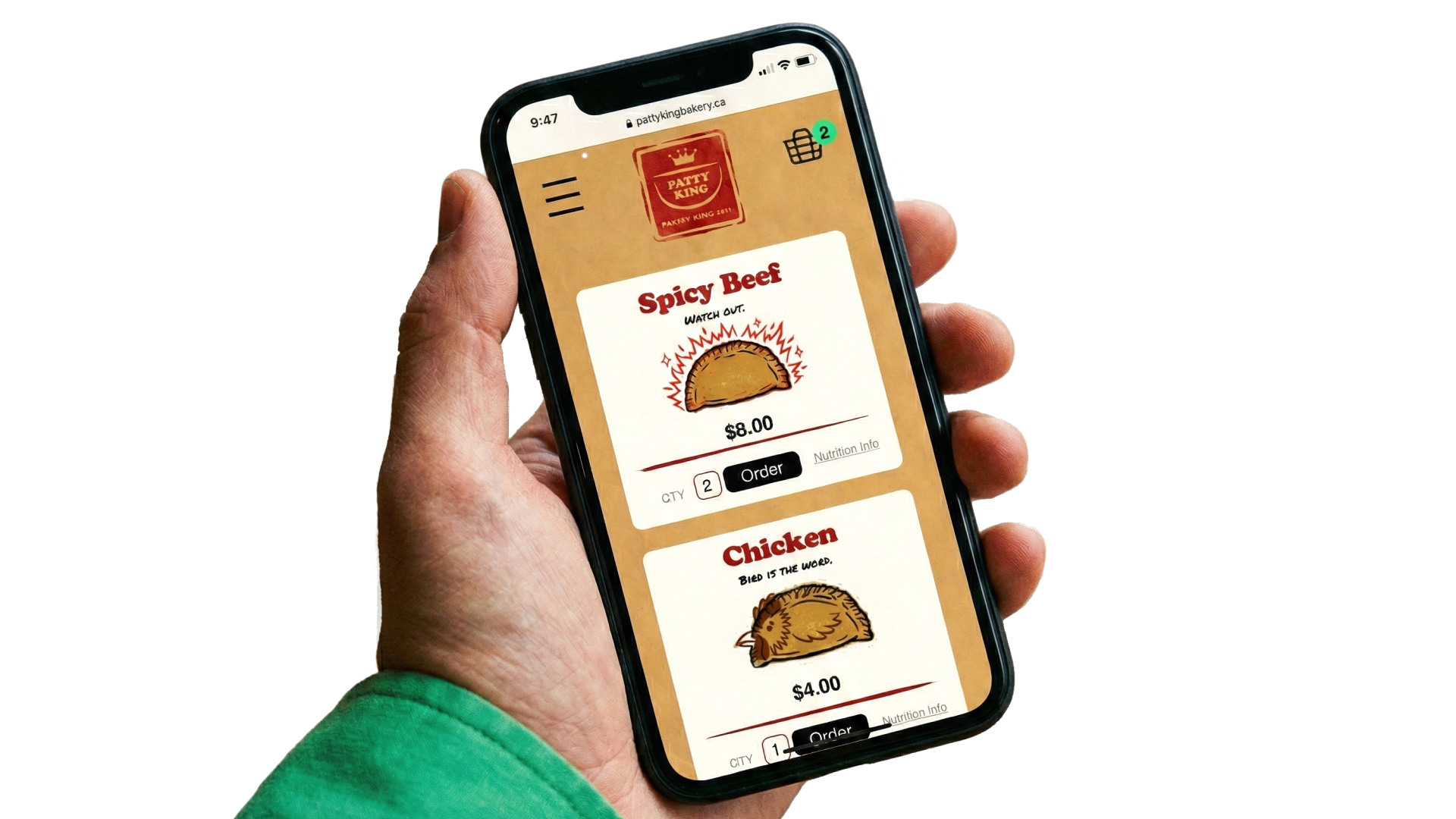
Omnichannel consistency. The UI translates the physical "heat" to the screen. The Jade Dot notification system (referencing the menu) creates a consistent visual language from the physical shop to the digital cart, reducing cognitive load for the user.

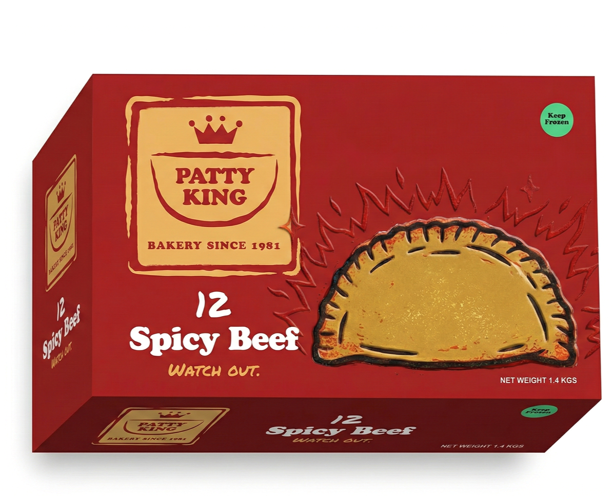
Shelf disruption through "Tactile Minimalism." In a freezer aisle cluttered with busy, photographic packaging, this box disrupts with clean white space and Lacquered Red text. The raised, embossed illustration invites the consumer to touch the box, creating a haptic connection that increases the likelihood of purchase.
Visual Identity | Brand Strategy | Creative Direction | Semiotic Analysis | UI/UX Design | Packaging Design | Art Direction | Copywriting | Print & OOH Design | Cultural Strategy
Situation
Patty King Bakery, a Kensington Market staple since 1981, was suffering from an identity crisis. Founded by a Chinese-Jamaican family, the bakery possessed a rich, authentic history, but its public-facing brand was a patchwork of inconsistent materials, generic clip-art, and dated web assets. In a gentrifying Toronto market hungry for "authenticity," Patty King looked like a generic commodity rather than a cultural icon. They were at risk of losing their narrative to newer, trendier competitors who were mimicking Caribbean culture without the lineage to back it up.
Task
The challenge was to rebrand the bakery to reflect its true "Double Diaspora" nature—the specific intersection of Chinese and Jamaican cultures. The goal was to avoid the lazy stereotypes of "Rasta" tricolors or dragon motifs. I needed to create a cohesive visual language that felt established and nostalgic (referencing 1981) but fresh enough to compete in the modern CPG and fast-casual market. The brand needed to signal "Structure holding Flavor."
Action
I developed a strategy rooted in cultural semiotics to negotiate the two identities:
Visual Semiotics: I audited the colors of both cultures, landing on a palette of Lacquered Red and Bright Jade (China) mixed with Light Gold and Midnight Black (Jamaica).
The "Somatic" Aesthetic: I directed photography using an Ektachrome film profile. This specific film stock creates a "high heat" look (saturated reds/golds) that subconsciously signals the 1980s era and makes the food look warm and alive, contrasting with the sterile look of modern digital photography.
Typography as Voice: I paired Cooper Black (evoking the soul of 60s/70s Jamaican vinyl) with a Permanent Marker font (evoking the immediacy of market stall signage).
Narrative Symbols: I utilized specific cultural anchors, such as the Jade Bangle and Gold Rings on the matriarch’s hands in key photographs featured in the bakery.
Result
The rebrand successfully repositioned Patty King from a "local bakery" to a "Cultural Brand." The cohesive identity system now spans physical space, packaging, and digital platforms. The "Double Diaspora" narrative has differentiated them in the market, allowing them to command a premium for their CPG products while maintaining street-level credibility. The new design doesn't just look like a bakery; it looks like a legacy.