Nuix
Investigating the DNA of Intelligent Data
Role: Creative Director & Design Lead
The Mission: Decoding the complexity of forensic AI analytics to pivot Nuix from a legacy contender to the undisputed authority in data intelligence.
The Vision: I directed a comprehensive brand overhaul spanning a new logo, digital design system, and global relaunch campaign to translate forensic complexity into radical clarity. My focus was architecting a visual language rooted in "Radical Truth," effectively positioning the brand as the Sage in a world of noise.
Jump to Case Study ↓
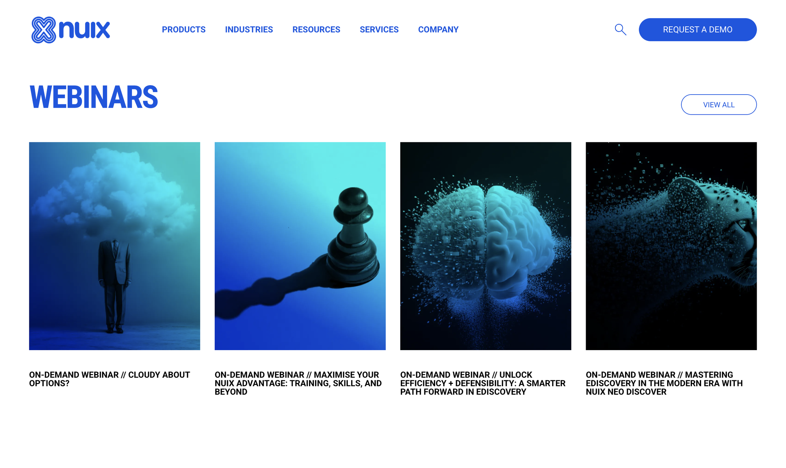
A complete reimaging of the Nuix digital ecosystem. I introduced a new logo and a responsive interface designed to reflect the sophistication of a platform that manages the world's most complex data.
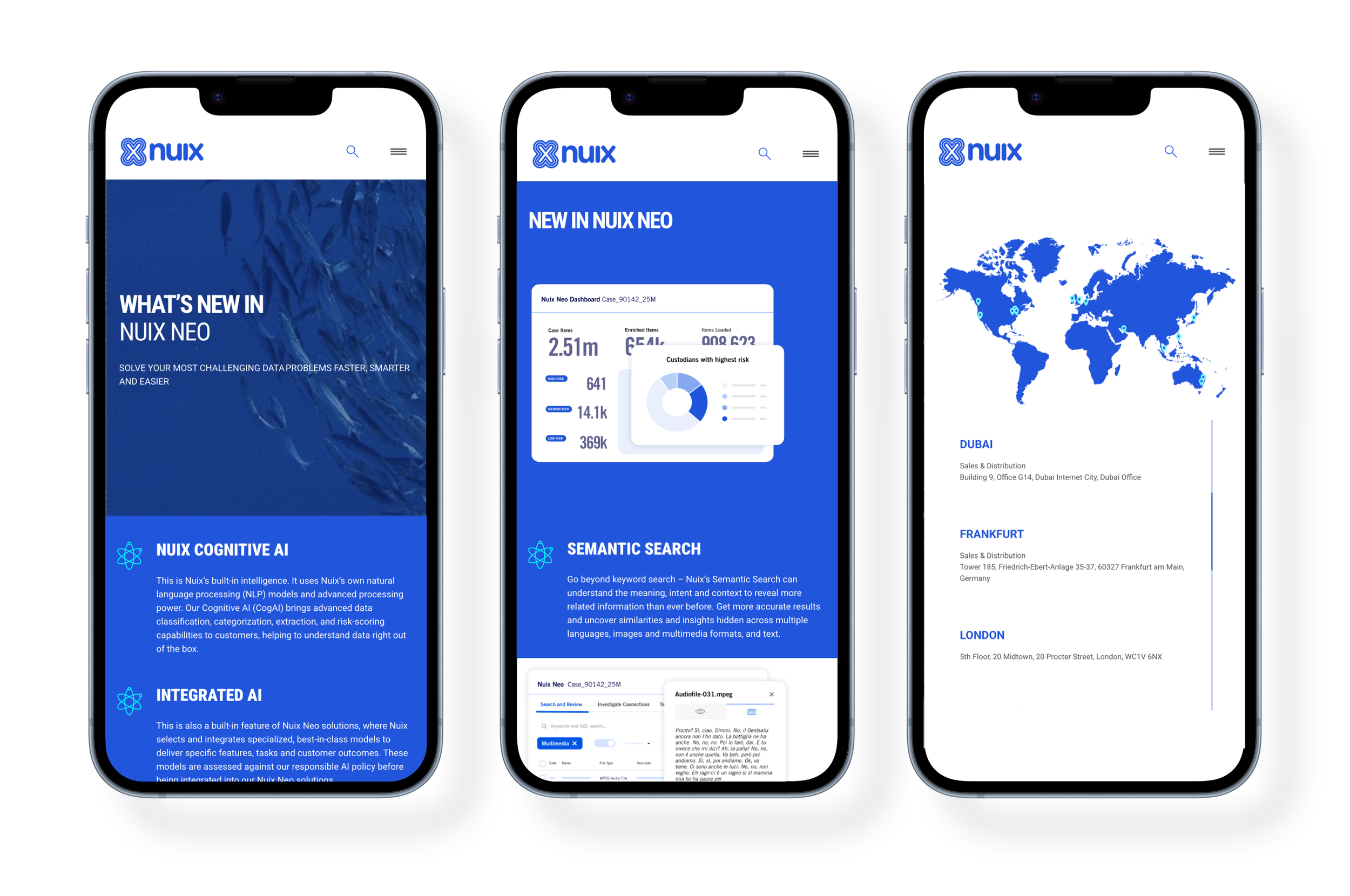

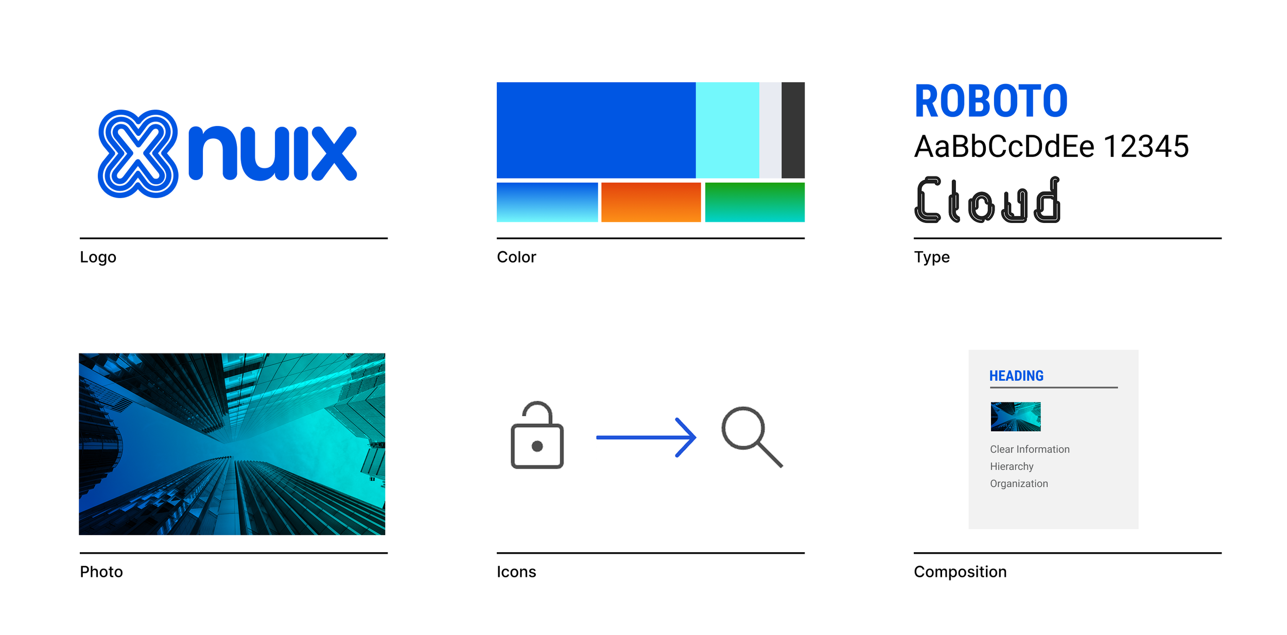
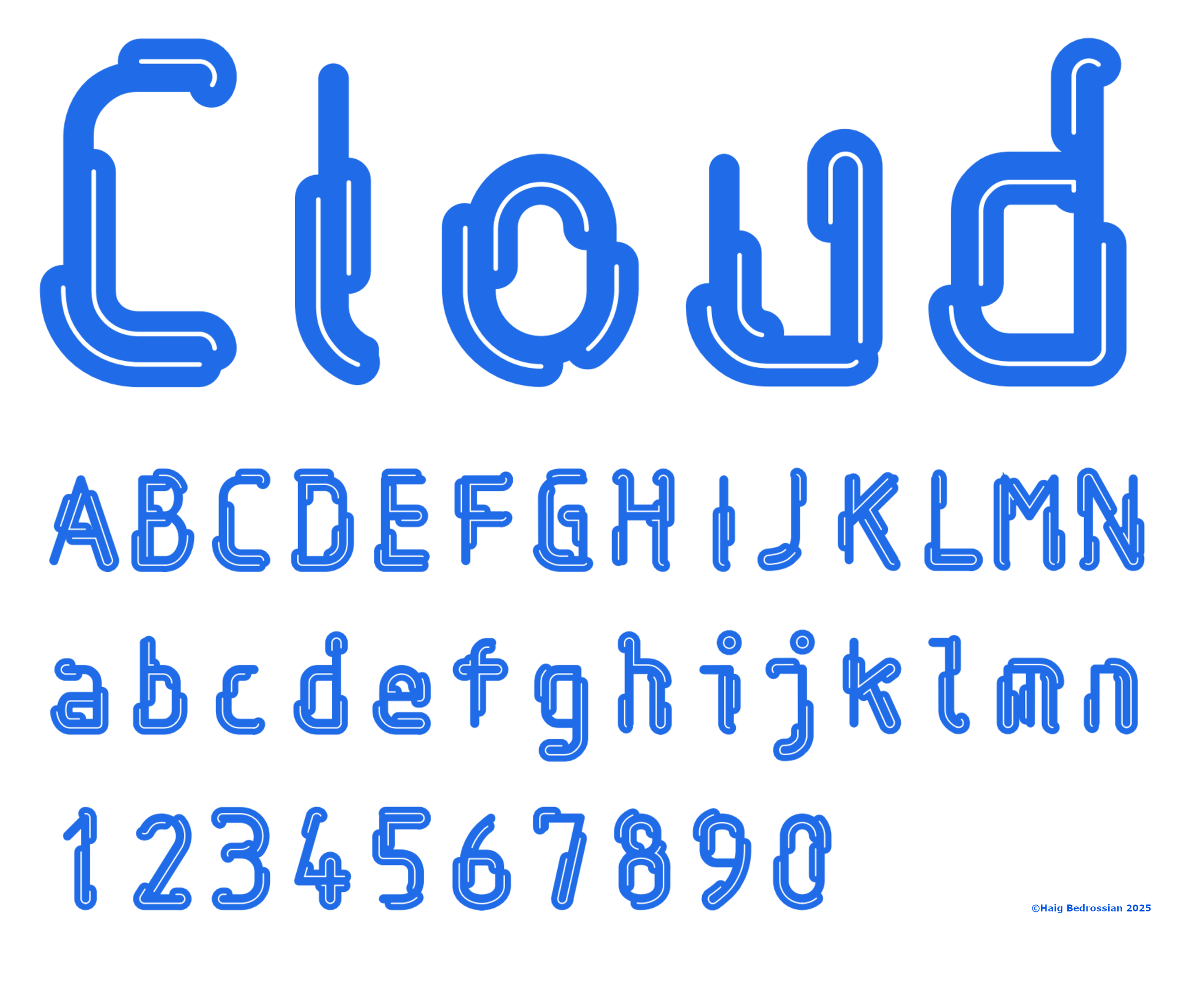
We built a rigorous visual system rooted in clarity. The toolkit features a custom typeface derived from the identity’s geometry, extending the brand equity into every headline. Minimal icons and organized compositions act as a "bento box" for information, bringing structure to the chaos of digital files.
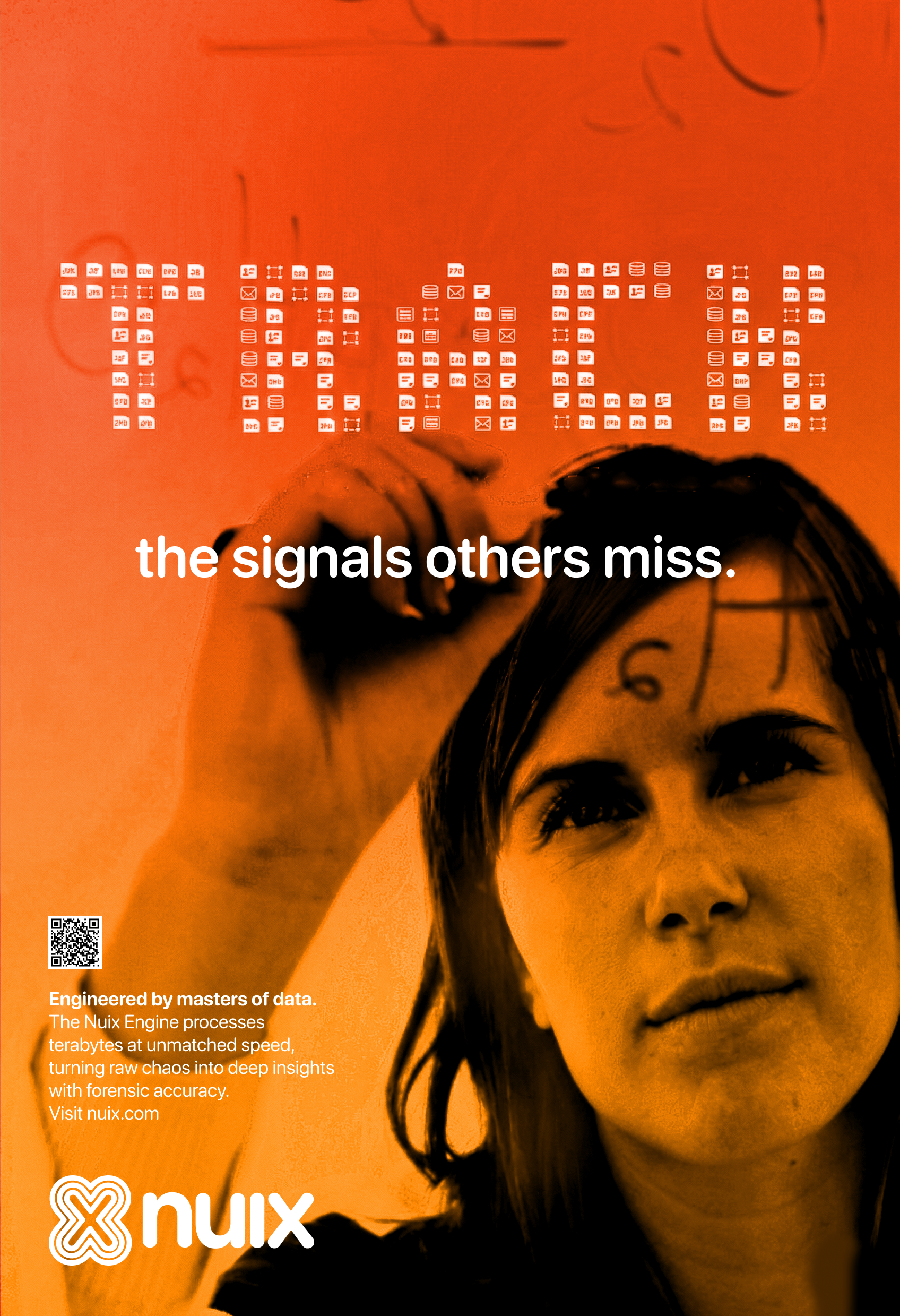


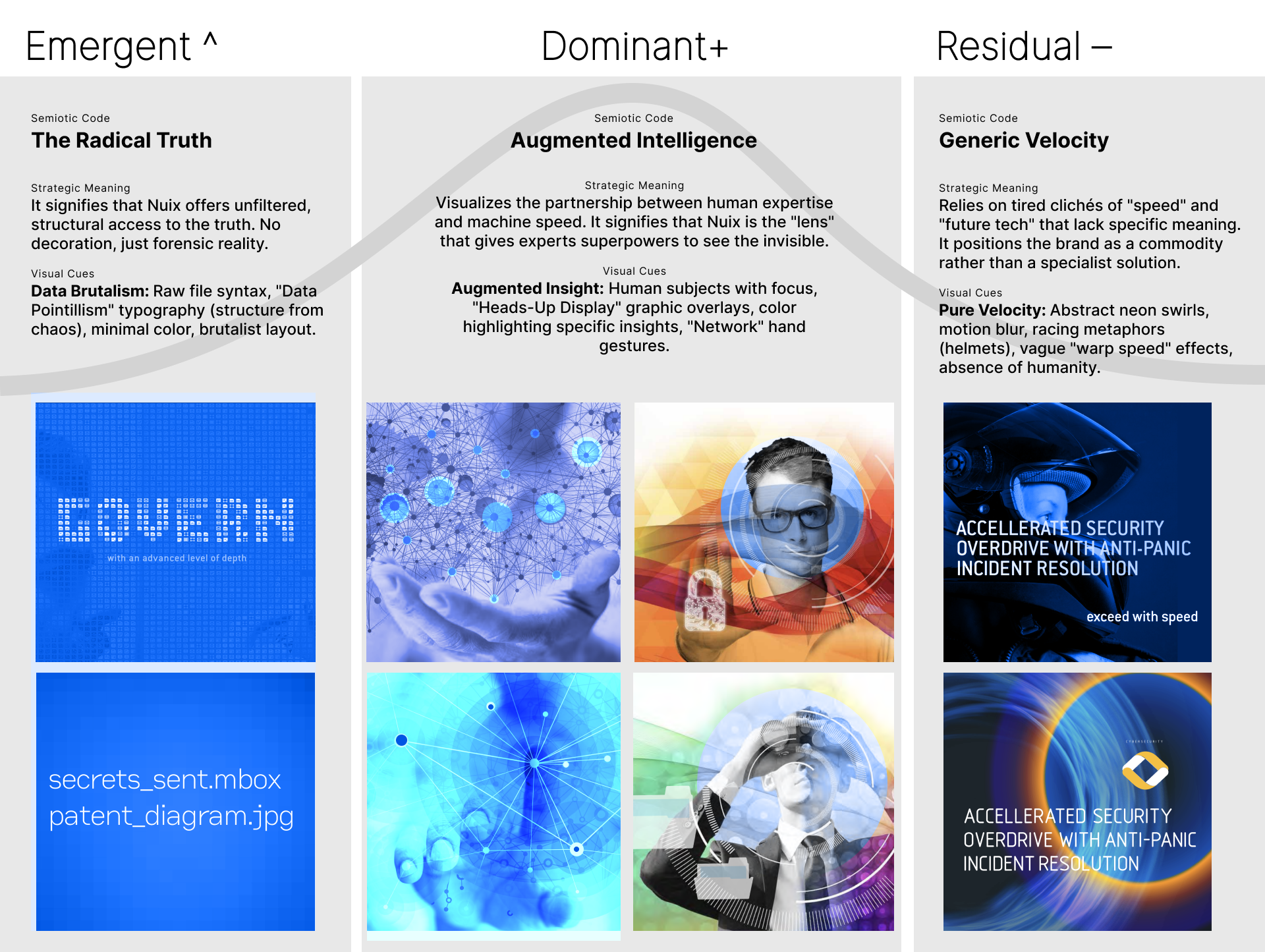
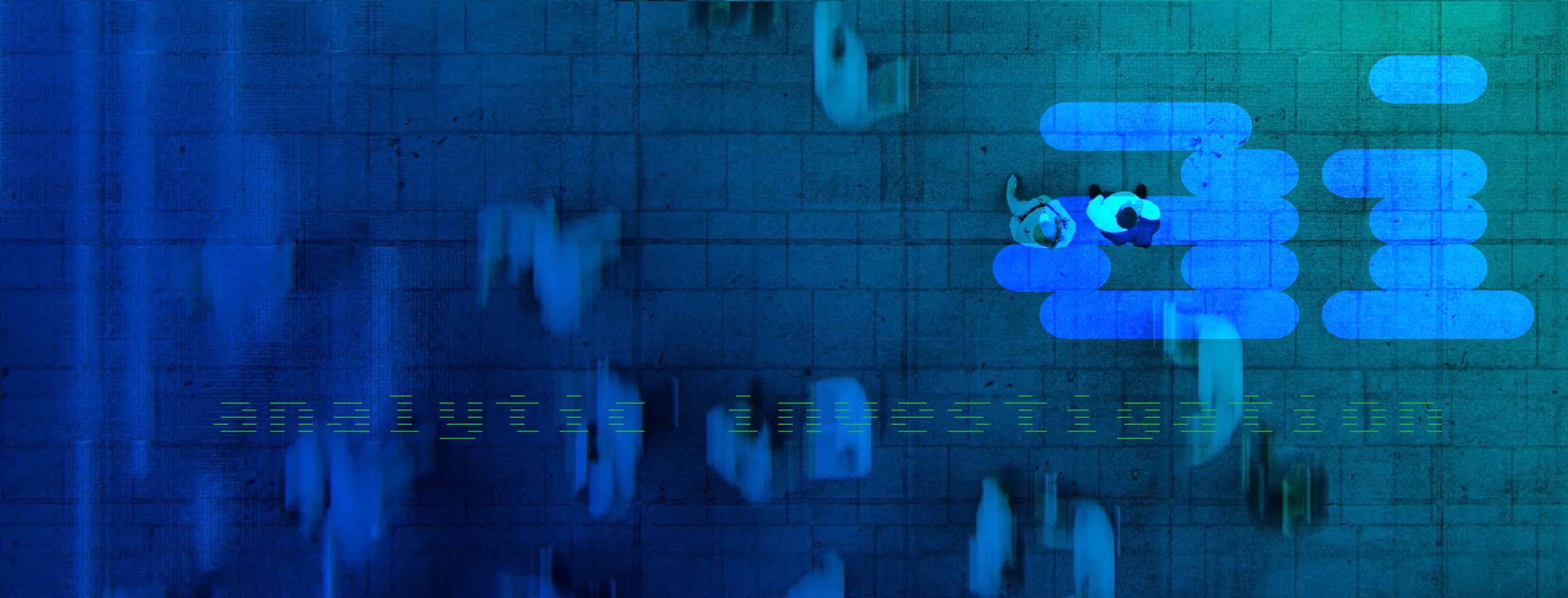
The process was driven by a semiotic framework, mapping visual cues through the lens of cultural time. We discovered that while competitors used metaphors to represent data, the "Emergent" opportunity for Nuix was to present the data itself. This led to "Data Pointillism," where the raw structure of file types and icons becomes the hero. Instead of hiding complexity behind smooth abstractions, we revealed it. This approach respects the user's intelligence, positioning Nuix as the only tool capable of bringing absolute order to forensic chaos.
Visual Identity | Brand Strategy | Creative Direction | Concept Development | UI/UX Design | IA | Custom Typography | Copywriting | Print & OOH Design | Semiotic Analysis
Situation
The Drift in the Data. For over 20 years, Nuix has been a global leader in investigative analytics, providing AI software that allows organizations to understand the context and connections across billions of data items. From government regulators to financial services, Nuix helps users find the "truth" in boatloads of unstructured data.
However, despite the product’s capability to save reputations and lives, the brand identity had drifted. Shaped early in the company's history, the visual language no longer reflected the sophistication or authority the product had achieved. The website suffered from a cluttered information architecture (IA) that disconnected the brand image from the user experience. In a market where competitors looked sleek and modern, Nuix’s outdated appearance was eroding trust. They needed a transformation that aligned with their market superiority and a digital ecosystem that could efficiently fill the sales funnel.
Task
Designing for Authority. My role was to lead the creative direction for a total brand overhaul and a new digital presence. The objectives were clear:
Redefine the Identity: Move the brand perception from a "reliable contender" to an "innovative market leader."
Fix the Experience: Rebuild the website with a human-centered design approach to untangle the cluttered IA.
Drive Growth: Integrate the site with Pardot to seamless capture leads and supercharge the sales pipeline.
Disrupt the Market: Launch a brand campaign that breaks the "sea of sameness" in B2B tech advertising.
Action
Decoding the Signal. The Semiotic Strategy We began by analyzing the competitive landscape through a semiotic framework. We found that competitors relied on "Residual" metaphors—glowing nodes, speed lines, and abstract shields—that signaled a legacy mindset. To position Nuix as the authority, we pivoted to a "Sage" archetype: the master of objective truth.
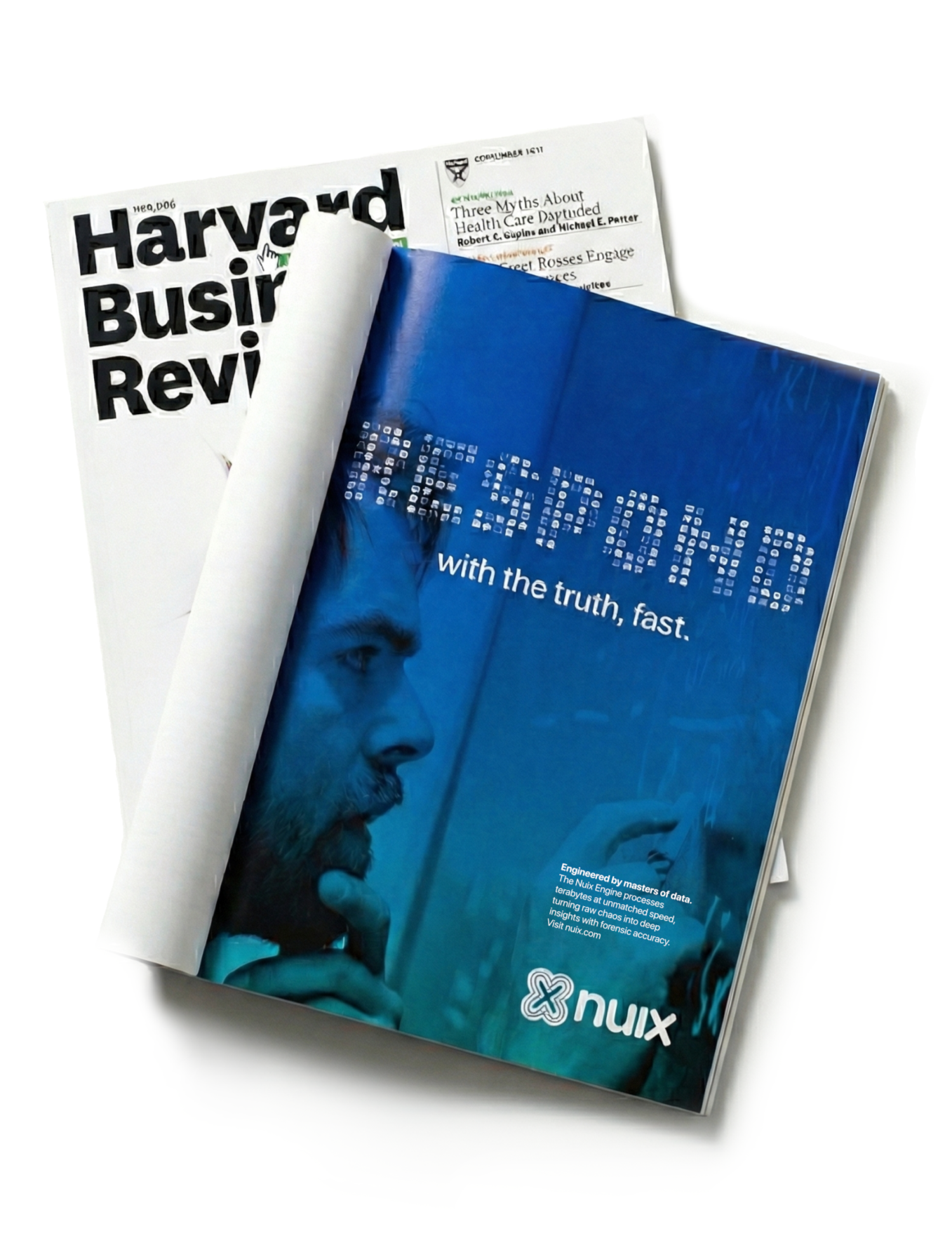
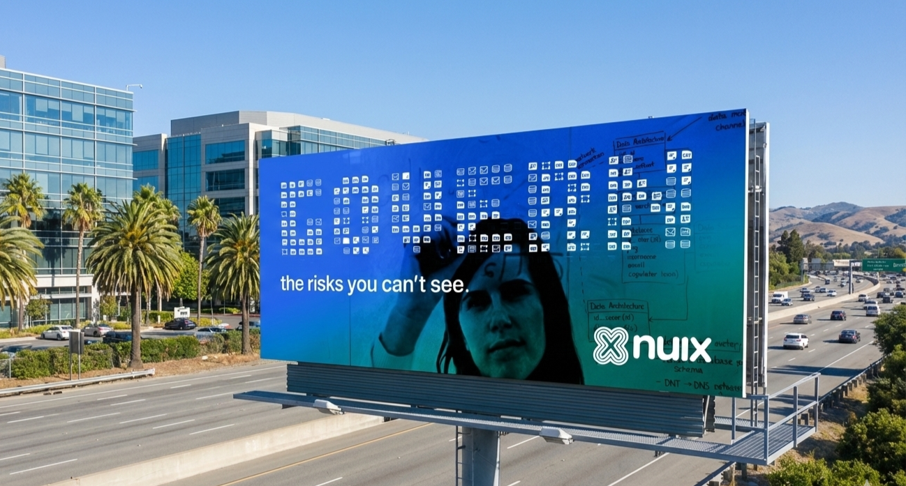
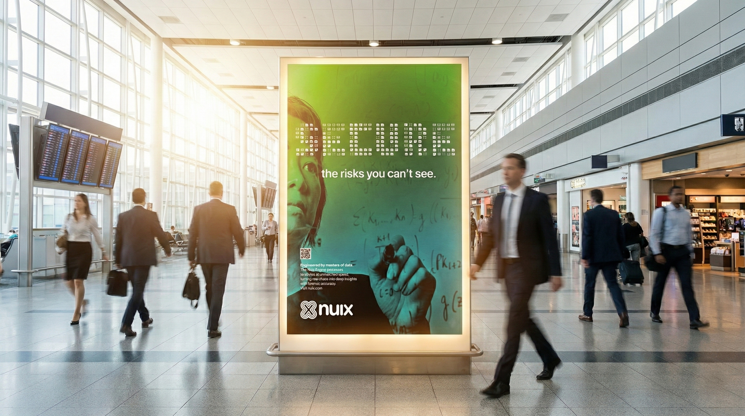
The Creative Solution: Data Pointillism We developed a visual language we called "Data Pointillism." Instead of using decorative tech magic to hide complexity, we used the raw structure of file icons (xls, jpg, mov) to build the narrative typography.
The Dominant Layer: We anchored the campaign with photography of intense experts working on glass walls—a visual code that signals "transparency" and "serious work" to C-suite buyers.
The Emergent Layer: We overlaid this with our Data Pointillism typography. This required the viewer to "decode" the image, an active engagement that signaled innovation to the technical user.
The Digital Transformation. On the web, we treated the interface like a tool for clarity. We streamlined the navigation to prioritize the user's needs—whether they were in Legal eDiscovery or Fraud Investigation. Working with a development partner, we built a solid CMS integrated directly with Pardot. This ensured that every "Request a Demo" interaction was captured, tracked, and nurtured, turning the website from a static brochure into a dynamic lead-generation engine.
Result
The rebrand successfully shifted Nuix from a participant to a leader, delivering measurable gains across the HEART framework.
Happiness (Perception & Satisfaction)
28% increase in survey respondents identifying the brand as "Innovative" rather than just "Reliable."
Analyst Recognition: Moved from "Contender" to "Market Leader" in primary industry reports
Engagement (User Attention)
15.05% increase in average time on page for the new Solutions pages.
198% increase in unique page views across the site.
35% lift in mobile search traffic from targeted event billboards.
Adoption (New Users & Leads)
24% increase in "Request a Demo" form submissions month-over-month.
22% increase in direct branded search traffic from targeted airport campaigns.
Retention (Brand Loyalty)
40% lift in unaided brand recall among the C-suite target demographic.
35% improvement in website exit rates, indicating users were finding value and staying longer.
Task Success (Sales Performance)
30% increase in closing sales for opportunities where prospects engaged with the new collateral.
18% of new enterprise leads explicitly cited the OOH campaign as a contributing factor in post-demo surveys.