Plivensia™
Designing Confidence for an End-to-End Patient Ecosystem
Role: Global Brand Experience Lead & Creative Director (Leading cross-disciplinary teams of researchers, instructional designers, and 3D artists across US, EU, & Japan)
The Mission: To humanize a complex biologic treatment by bridging the gap between sterile clinical efficacy and the emotional realities of the patient journey.
The Vision: Transforming a source of patient anxiety into a system of confidence, turning a standard prescription into an optimistic, lifestyle-integrated brand ecosystem.

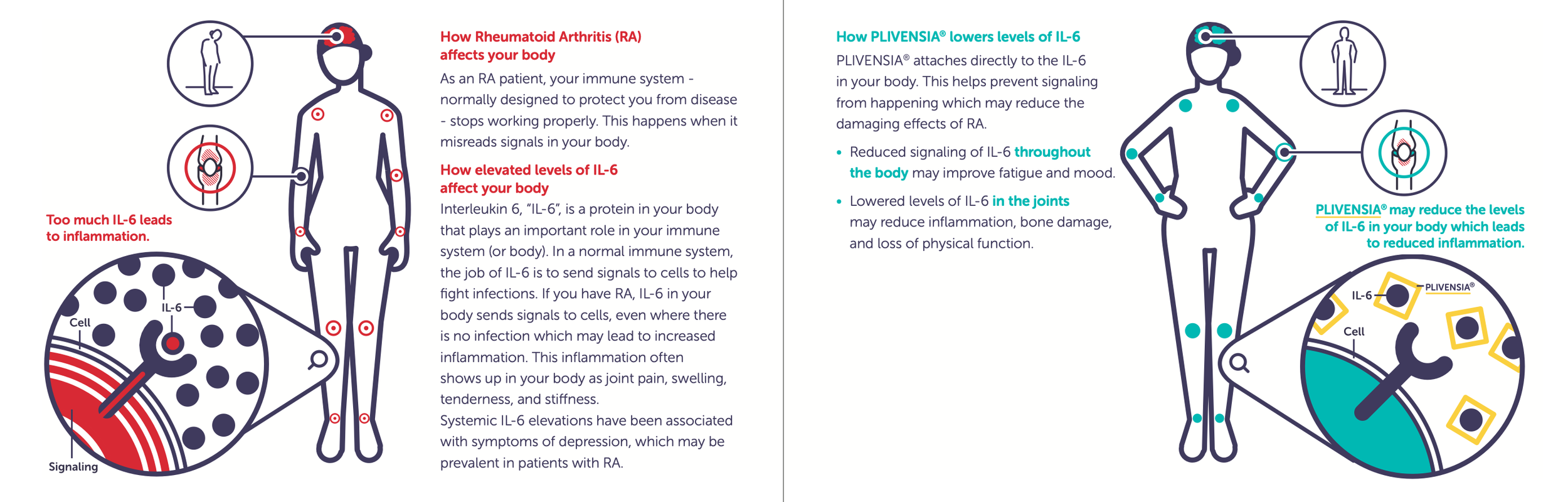
To break through the "medical gray" of the Rheumatoid Arthritis market, we launched with a visual language of radical optimism. Using the core pillars—Heal, Defend, Protect—these social and digital assets utilize the brand’s "radiating line" motif to visualize the drug's protective shield. The motion is fluid and the yellow palette is vibrant, signaling energy rather than illness.
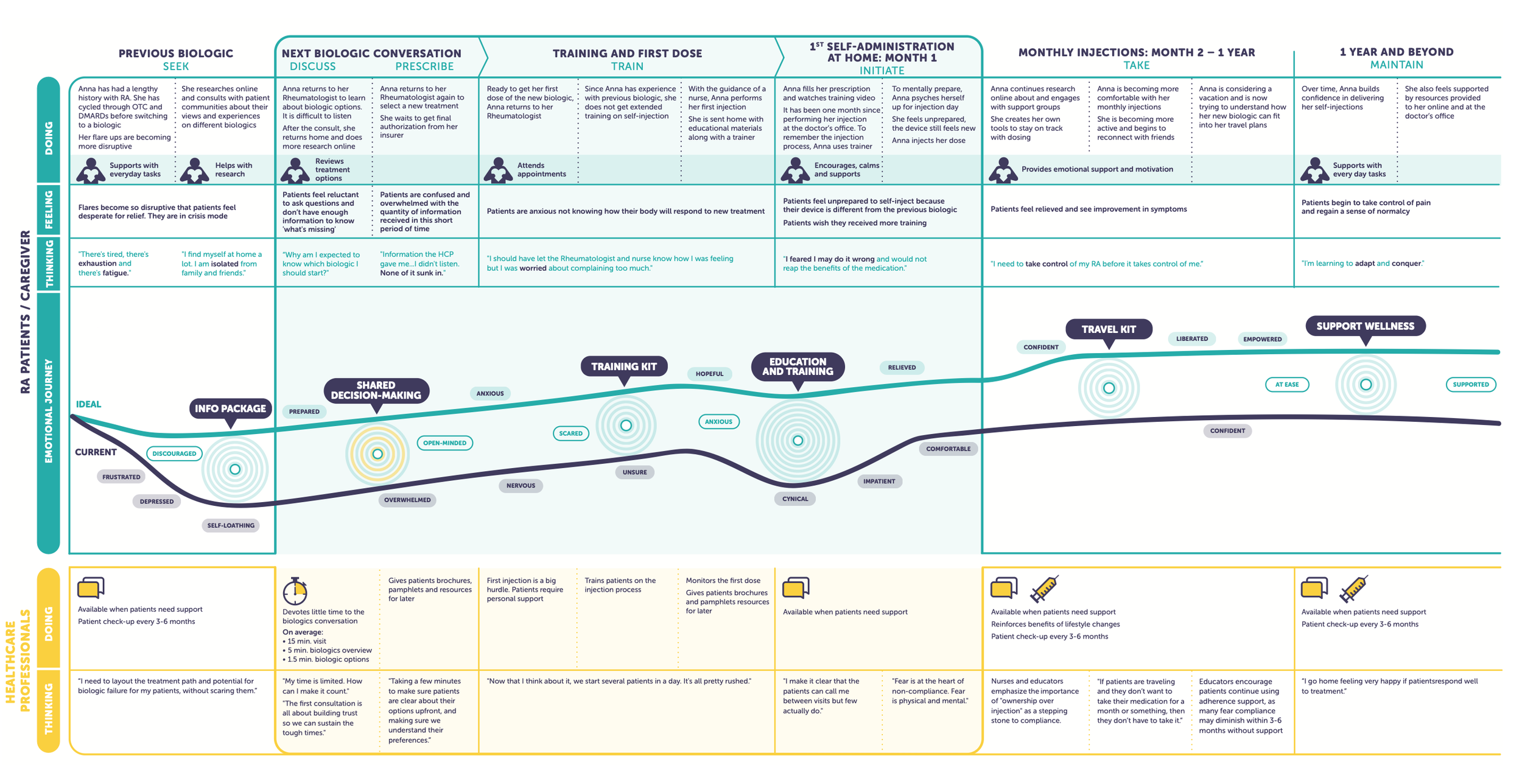
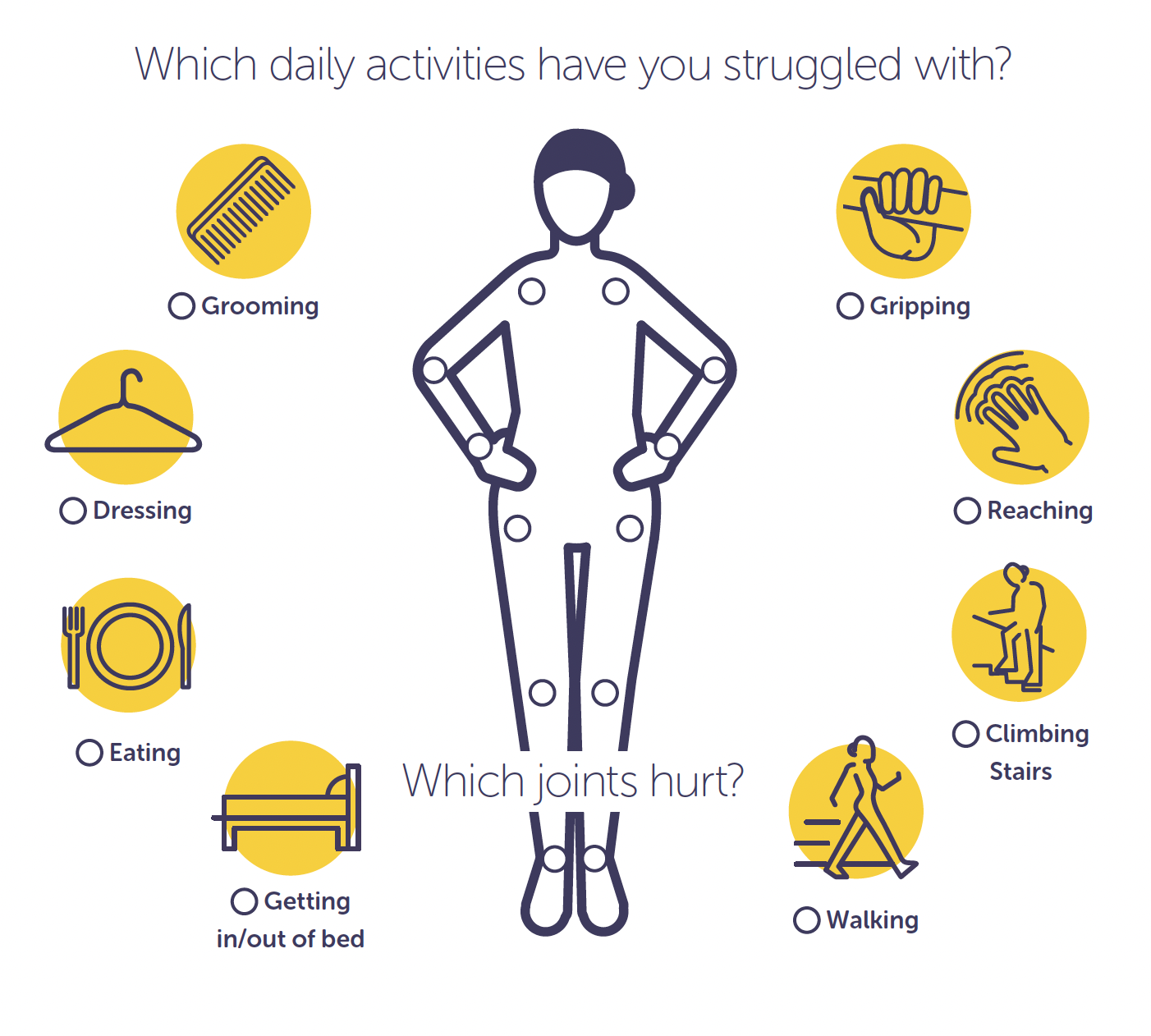
Great design starts with empathy. Before a single pixel was placed, we mapped the end-to-end patient experience to identify friction points. This journey map became our strategic blueprint, highlighting moments of high anxiety (like the first injection) and identifying where design could intervene to provide clarity and comfort.

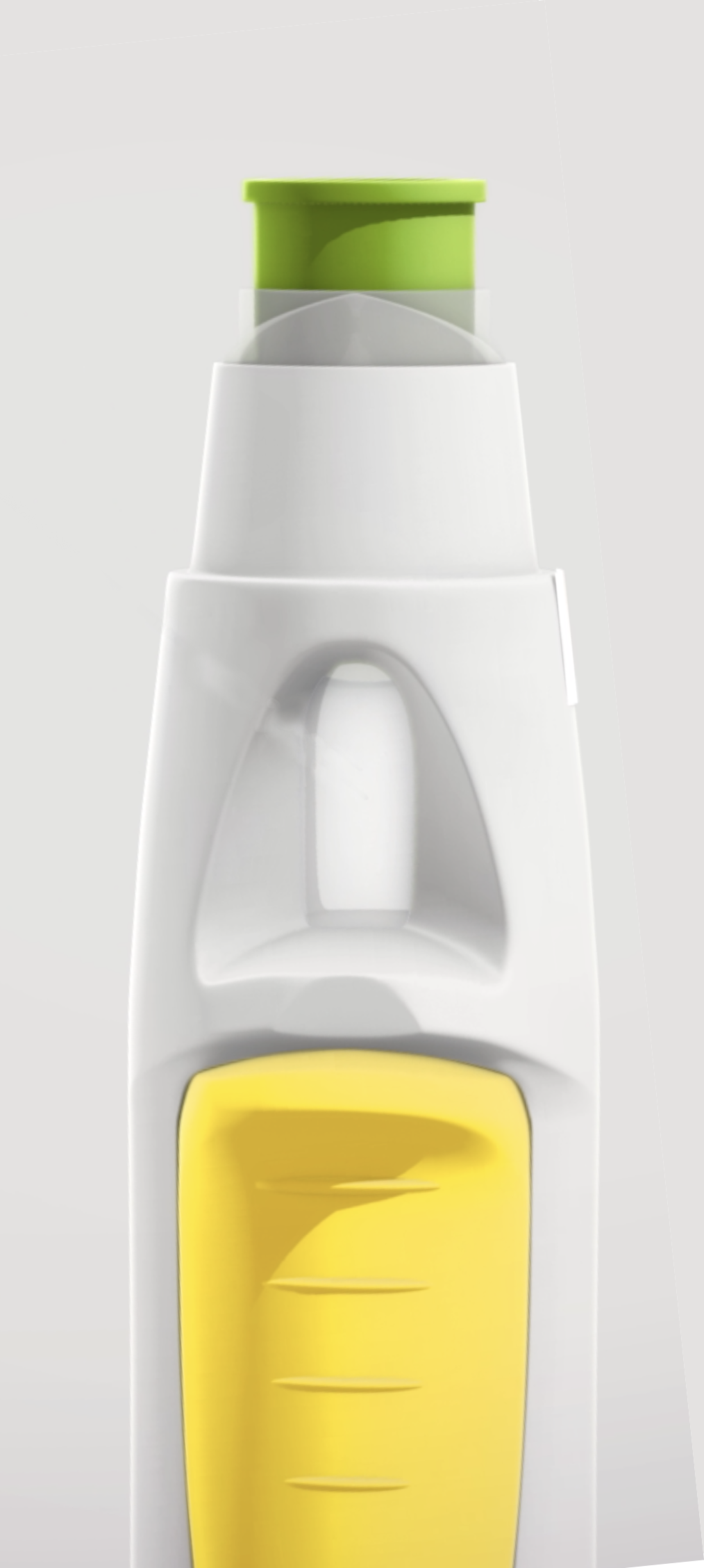
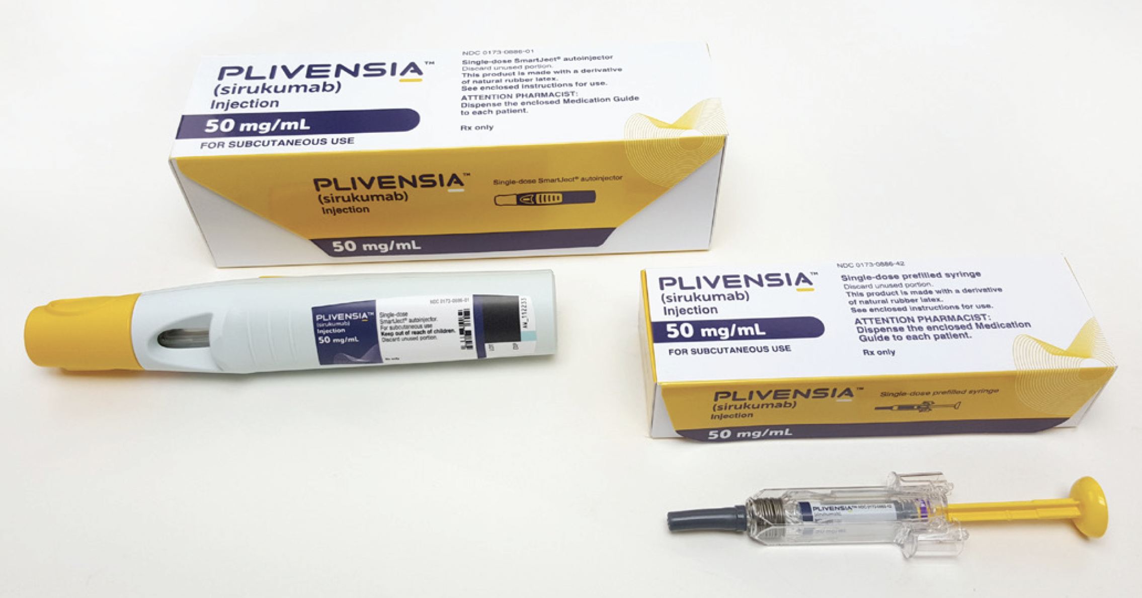
For RA patients with limited hand dexterity, packaging is often a barrier. We designed a pharma-compliant structural system that is easy to open and handle. The visual design uses a continuous yellow line that acts as a "guide rail," traversing the outer box and continuing onto the autoinjector itself, subtly directing the eye and hand toward the active injection points.
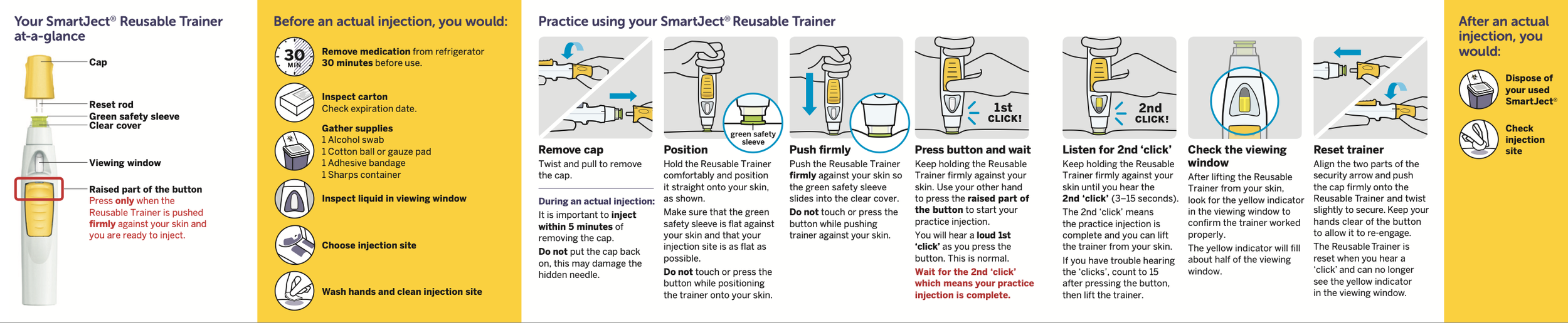
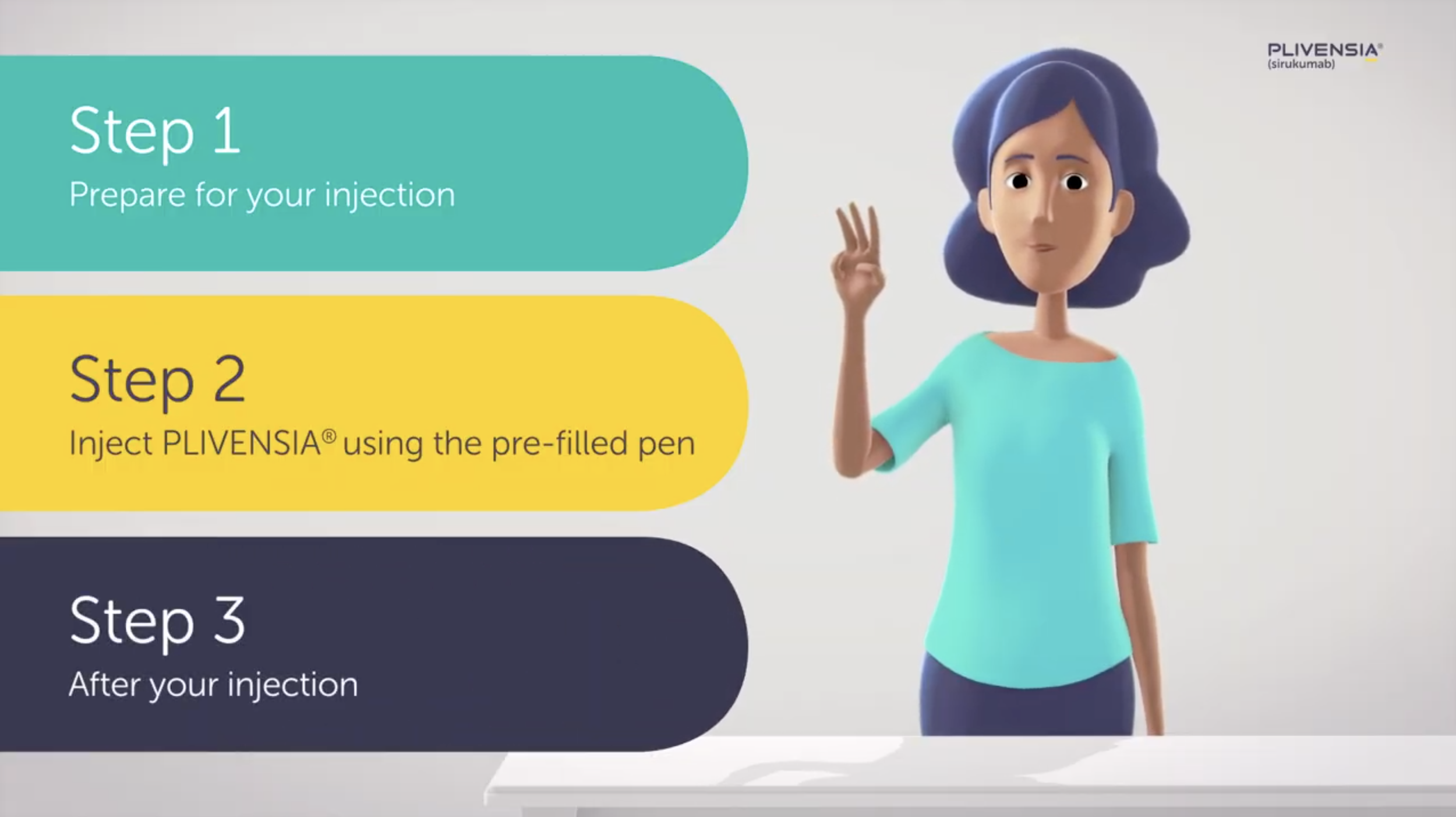
The "SmartJect" training materials were designed to reduce the cognitive load of self-injection. Moving away from sterile technical diagrams, I directed the creation of a character-driven 3D narrative. This "visual chapter" approach breaks the complex medical procedure into simple, human steps—uncap, place, press—building user confidence through clear, friendly motion graphics.
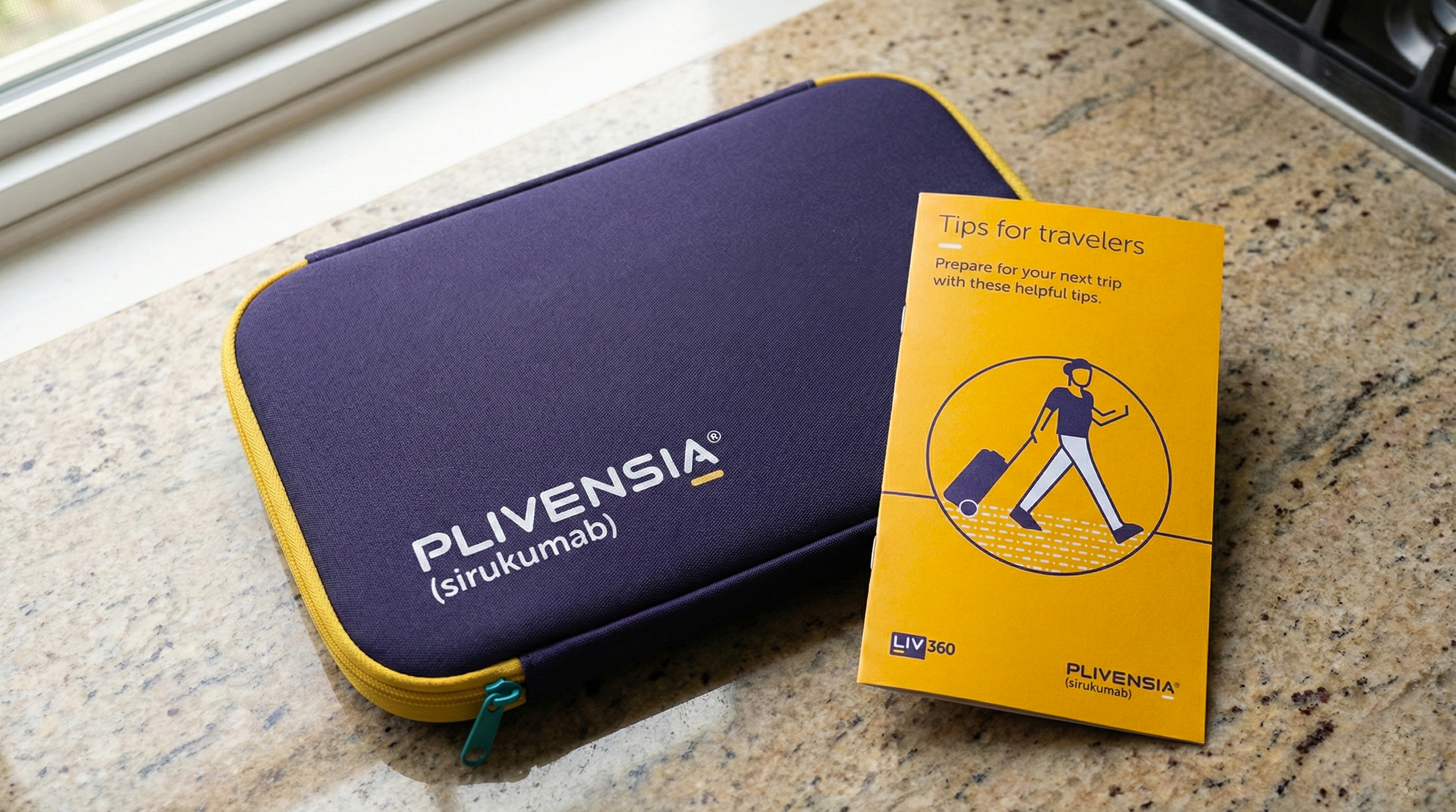
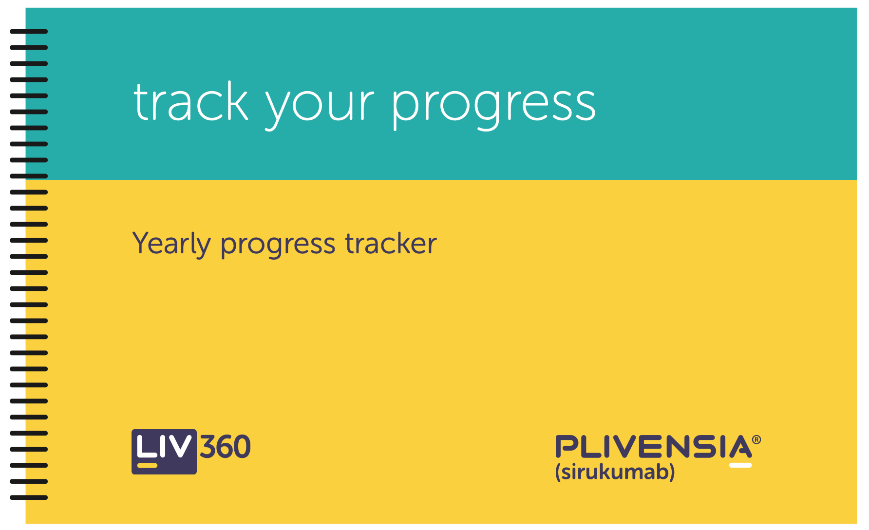
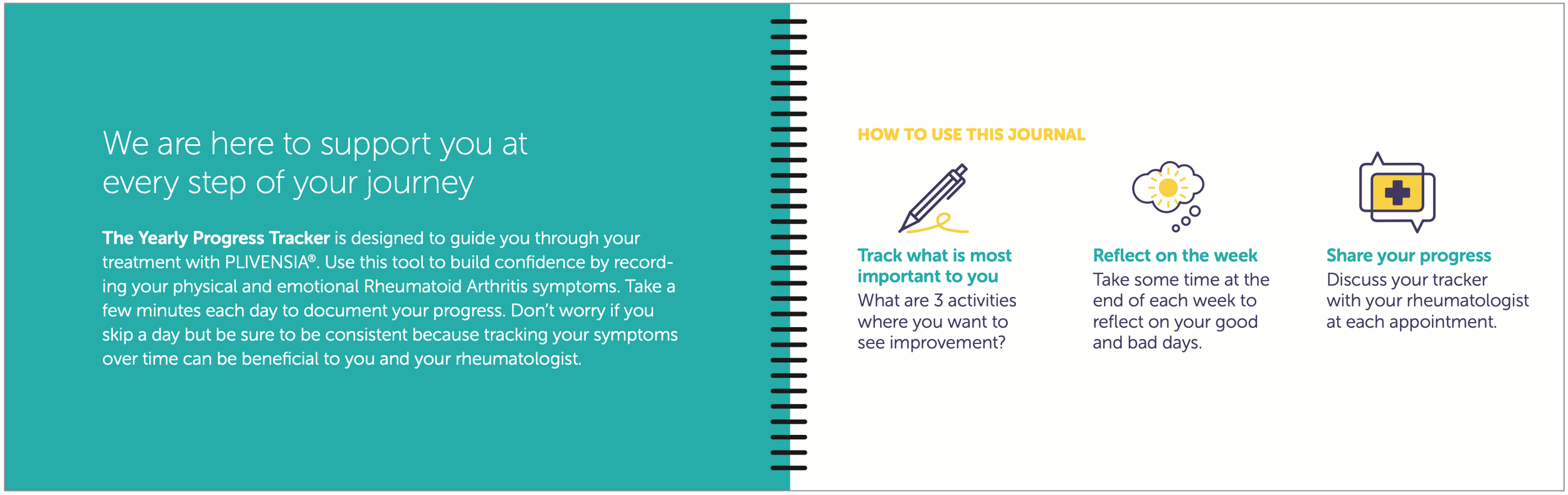
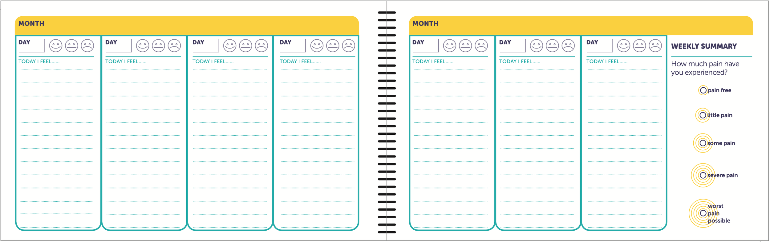
A chronic condition requires chronic support. We developed the LIV360 ecosystem to support the patient's lifestyle, not just their illness. From travel kits that keep the medication cool on vacation to yearly progress trackers that help patients visualize their health goals, these tools ensure the brand remains a helpful, non-intrusive partner in their daily life.

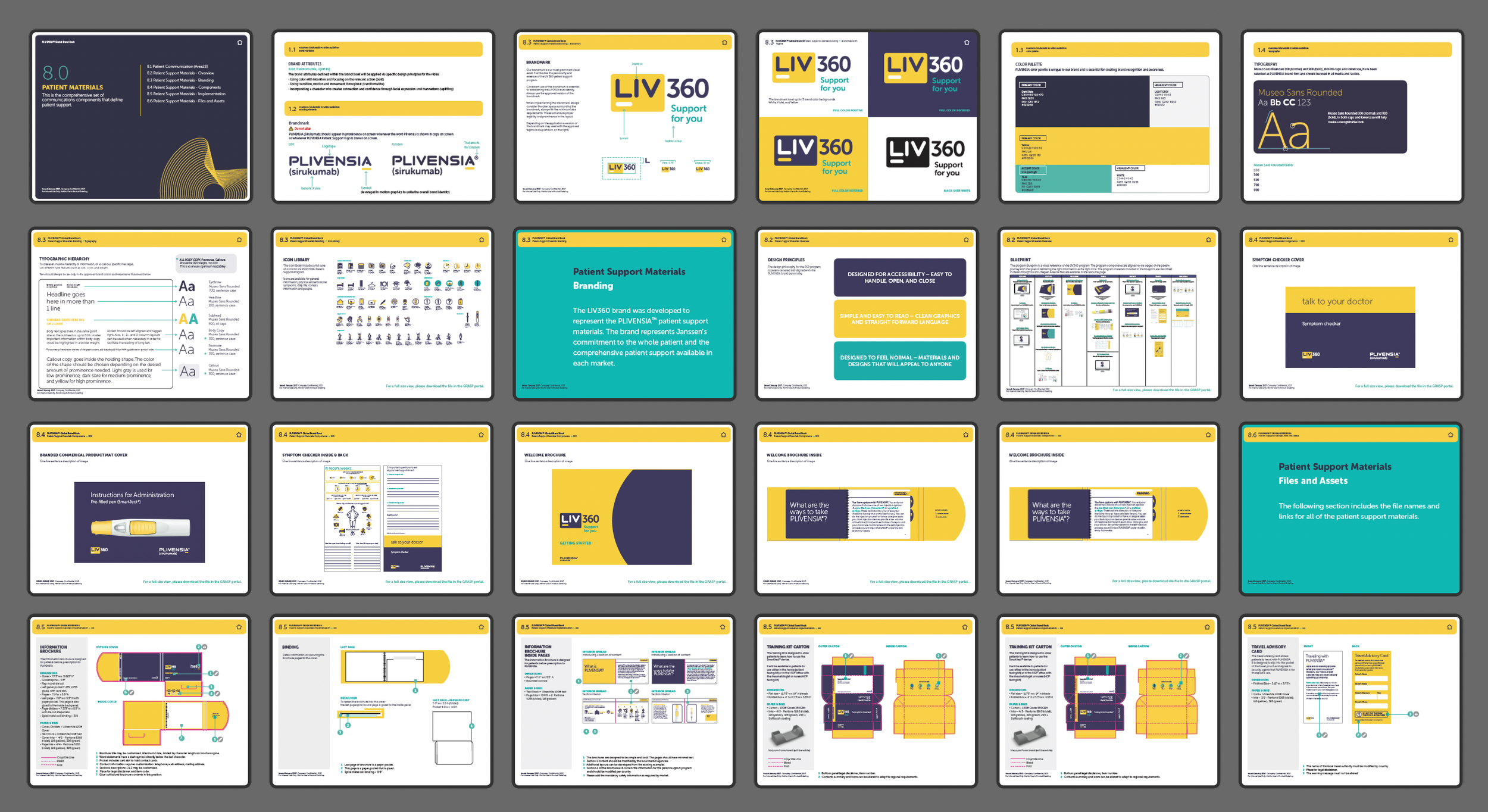
To ensure the brand resonated across US, EU, and Japanese markets, I developed a comprehensive design system. The "Brand Expression Flexibility" model guides agencies on how to adapt the visual volume—dialing it up for emotive marketing or down for precise clinical instruction. Whether on a trade show floor or a sales rep’s iPad, the experience remains cohesive: professional, accessible, and human.


Patient Journey Mapping | Messaging & Brand Strategy | Packaging System | Instructional Design | Campaign Development | 3D Video & Motion Graphics | Social Media Content | Advertising | Environmental Design | UI/UX & Digital Tools
Situation
Rheumatoid Arthritis (RA) is a debilitating, lifelong condition. For patients, switching to a new biologic treatment involves high anxiety—specifically regarding the self-injection process. The RA market was crowded with established competitors, and the client (Janssen/GSK) needed to launch "Plivensia" not just as a drug, but as a supportive partner. The primary friction point was the transition from diagnosis to daily life: patients felt overwhelmed by medical jargon and fearful of the device.
Task
My mandate was to lead the end-to-end brand experience design, bridging the gap between clinical efficacy and human empathy. I needed to create a global system that covered the entire patient lifecycle—Explore, Discuss, Prescribe, Train, Initiate, Travel, and Maintain. The goal was to translate a complex medical regimen into an accessible, non-threatening lifestyle brand that adhered to strict pharma compliance while embodying the principle: "No decisions about me, without me."
Action
I directed the strategy and execution over a 3-year period, from clinical trials to market launch, focusing on four key pillars:
Human-Centric Strategy: We mapped the emotional journey of the patient, identifying fear points around the "first injection." I established experience principles focused on accessibility and co-creation, ensuring the system felt like a "help" rather than a "prescription."
Visual Semiotics of Optimism: To counter the clinical coldness of RA treatments, I developed a visual identity rooted in vibrance. We utilized a bright yellow and green palette to signal energy and optimism. A "radiating line" motif was introduced to visualize the transformative effect of the medication—subtle and technical, yet warm.
Cognitive Accessibility (Instructional Design): I oversaw the development of the "SmartJect" educational materials. This included managing instructional designers and 3D artists to create an IFU (Instructions For Use) video and booklet. We developed a character-driven narrative that broke complex medical steps into simple, guided visual chapters, rigorously vetted by clinical SMEs to ensure patient confidence.
The "LIV360" Ecosystem: Beyond the drug, we designed for the patient's life. This included the "Travel with Plivensia" kit, yearly progress trackers, and conversation guides for doctor visits. This ensured the brand presence was helpful, not intrusive, supporting adherence long-term.
Result
The Plivensia launch successfully established a new benchmark for patient-centered care in the RA category. The cohesive design system—spanning packaging, digital, and physical tools—reduced patient anxiety during onboarding. The Instructions For Use (IFU) materials were lauded for their clarity, directly contributing to higher successful self-administration rates in testing. By shifting the visual language from "sick care" to "optimistic living," we created a brand that patients felt empowered to bring into their homes.