Nuix
Investigating the DNA of Intelligent Data
I led the comprehensive brand overhaul of Nuix, decoding the complexity of forensic AI analytics to pivot the company from a legacy contender to the undisputed authority in data intelligence. By implementing The Stealth Logic Architecture, we achieved a 30% increase in sales closings and moved the brand from "Contender" to "Market Leader" in industry reports.
Category AI Technology / Forensic Analytics Global Enterprise B2B
Role Creative Director & Design Lead
For over 20 years, Nuix has led global investigative analytics, using AI to find truth within billions of data points. However, the brand identity had drifted, lagging behind the product's actual sophistication. I directed a total transformation that spanned a new logo, a responsive digital design system, and a global relaunch campaign designed to translate forensic complexity into radical clarity.
We transformed the brand into a "Sage" archetype (the master of objective truth) to stand out in a sea of abstract tech clichés.
Impact at a glance
30% increase in sales closings for opportunities engaging with new collateral
198% increase in unique page views across the global digital ecosystem
24% lift in "Request a Demo" submissions month-over-month
Moved to "Market Leader" status in primary industry analyst reports
28% boost in brand perception as "Innovative" rather than just "Reliable"
The Challenge: The Drift in the Data
While Nuix software protects reputations and lives, its visual identity was eroding trust. A cluttered digital experience and an outdated aesthetic disconnected the user journey from the brand’s authority.
The B2B tech space was crowded with competitors using the same "Residual" metaphors (glowing nodes, speed lines, and abstract shields). These signals suggested a legacy mindset and "category drift." To reclaim its lead, Nuix needed to stop hiding behind tech abstractions and start celebrating the raw power of its data intelligence.
My mission was to: "Position Nuix as the absolute authority by revealing the truth within the noise”
Approach: Building Leverage Through The Stealth Logic Architecture
1. Semiotic Mapping and the "Sage" Archetype
We began by analyzing the competitive landscape through a semiotic framework. We discovered that while rivals used metaphors to represent data, the "Emergent" opportunity for Nuix was to present the data itself. We shifted the brand from a "reliable contender" to the "Sage" (a master of objective truth who respects the user's intelligence).
2. Digital Lead-Generation Infrastructure
We treated the interface as a tool for clarity rather than a static brochure.
Human-Centered IA: We untangled a cluttered information architecture to prioritize user needs, whether they were in Legal eDiscovery or Fraud Investigation.
Pardot Integration: We built a modular CMS integrated directly with Pardot, ensuring every "Request a Demo" was captured, tracked, and nurtured through the sales funnel.
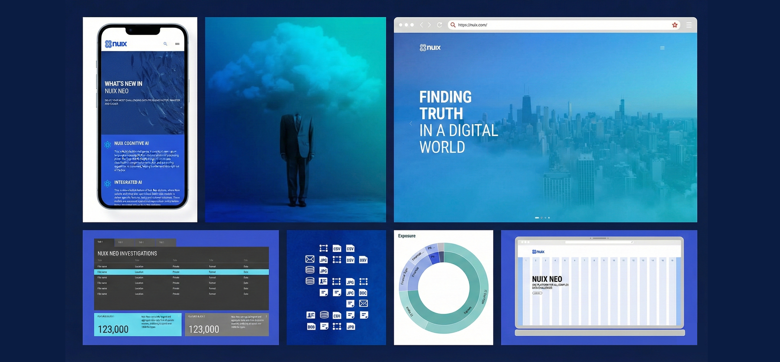
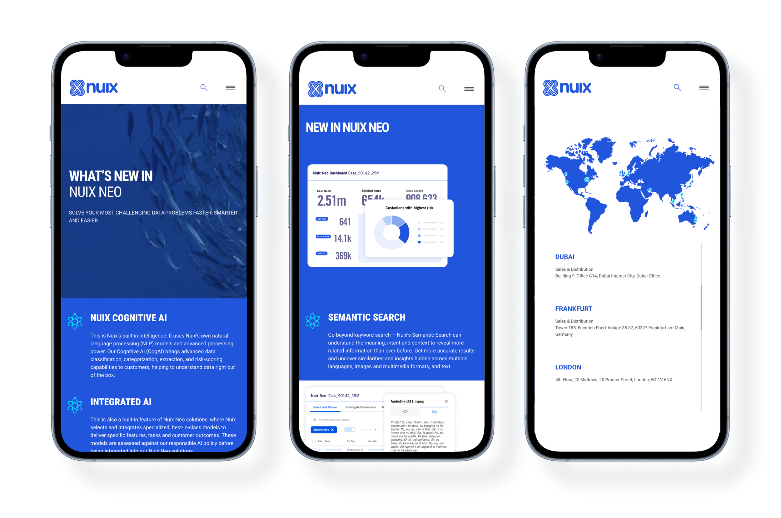
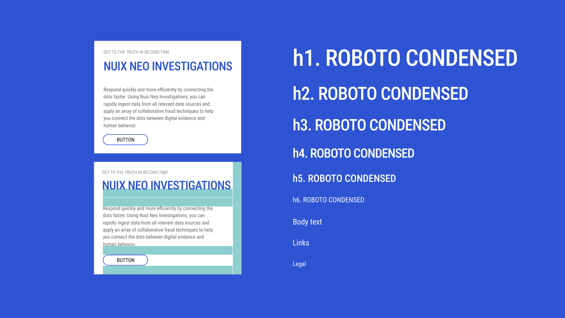
3. The UI Design System: Nuix Neo
Before launching the campaign, we had to fix the product experience. We developed a high-density UI design system for the Nuix Neo platform that prioritized investigative focus.
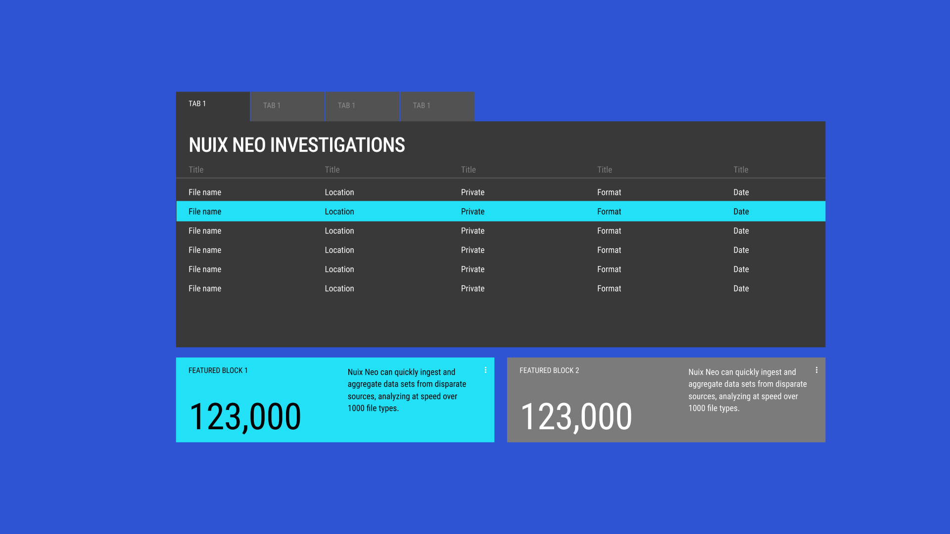
The Onyx Environment: We utilized a deep indigo and onyx palette for the primary interface. This dark mode reduced eye strain for forensic investigators while allowing the data points to "pop" with luminous clarity.
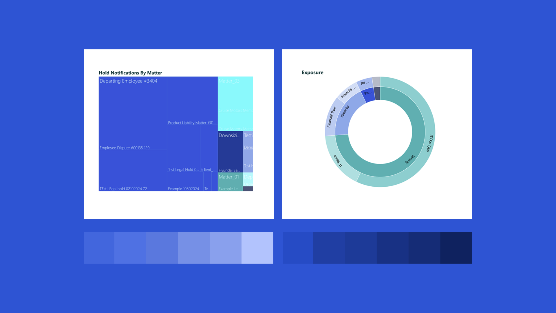
Bento Box Modularity: We introduced a bento style layout grid. This allowed complex dashboards (billing, exposure charts, and investigation tables) to exist in a structured, modular environment that felt organized rather than overwhelming.
Teal Precision: We used a bright cyan/teal as our primary action color. This "digital spark" was reserved for critical data insights, navigation highlights, and success states, creating a clear visual hierarchy in high-stakes environments.
-
![]()
Nuix design system
-
![]()
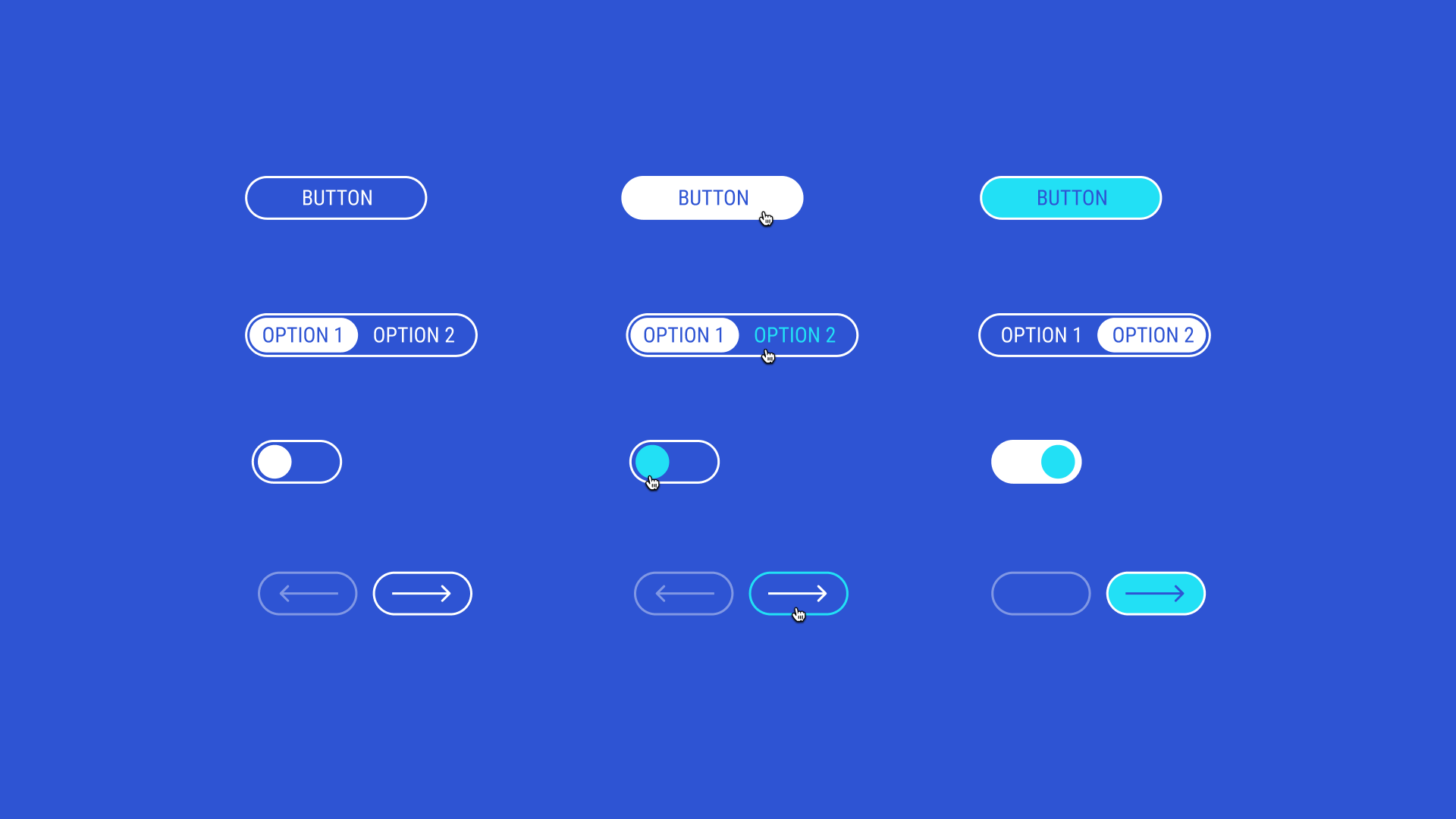
Buttons
-
![]()
Carousel
-
![]()
Data visualization
-
![]()
Table dashboard
-
![]()
Typography


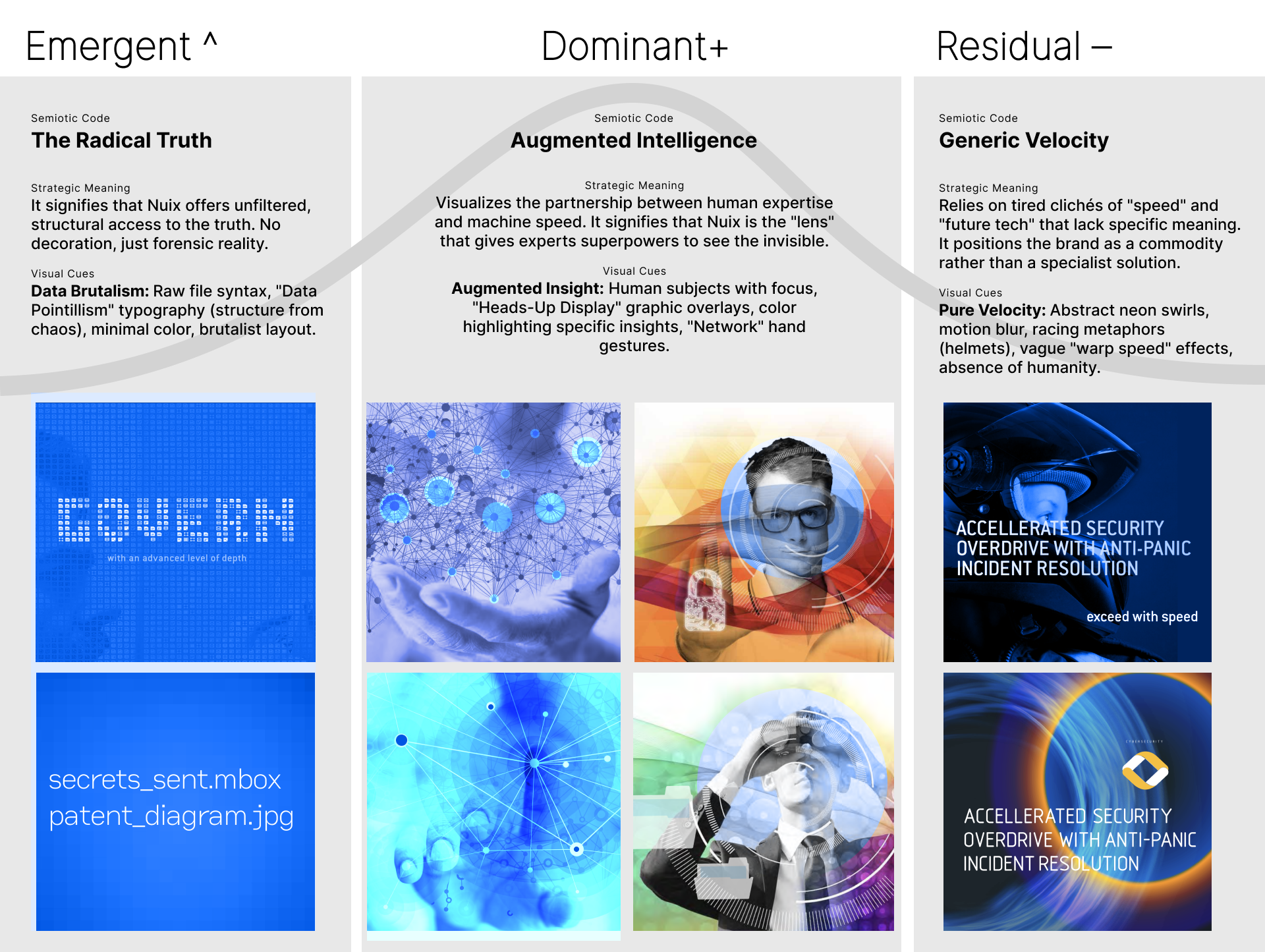
The Visual Solution: Structure vs. Tension
The power of the Nuix rebrand lies in the contrast between the rigid structure of the product and the conceptual "pull" of the campaign.
The Design System: The Laboratory
The UI is the "Laboratory," a controlled and precise environment where truth is processed. It is characterized by clean verticality, structured tables, and mathematical doughnut charts. It signals to the user that the tool is reliable, powerful, and built for professional-grade forensics.
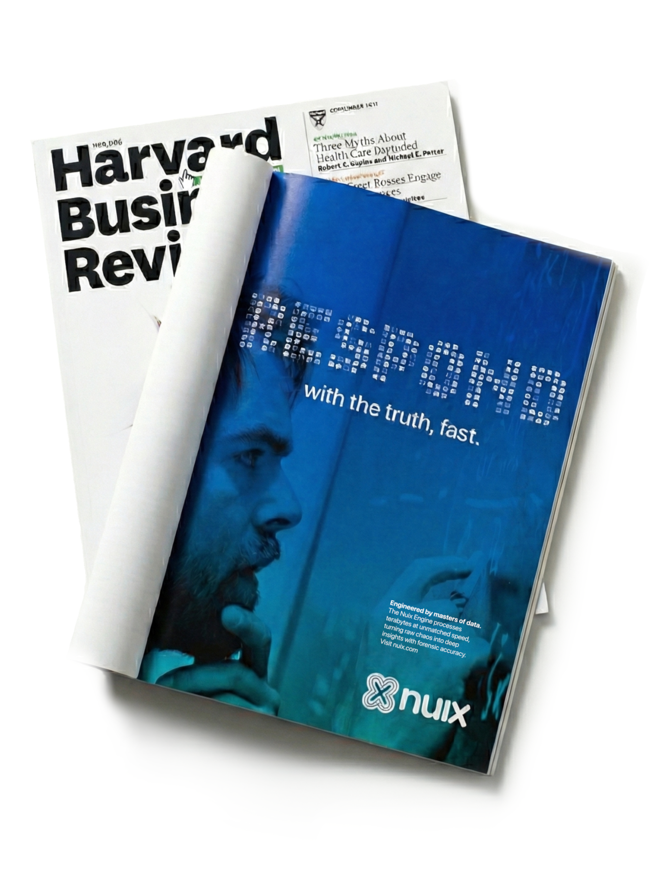
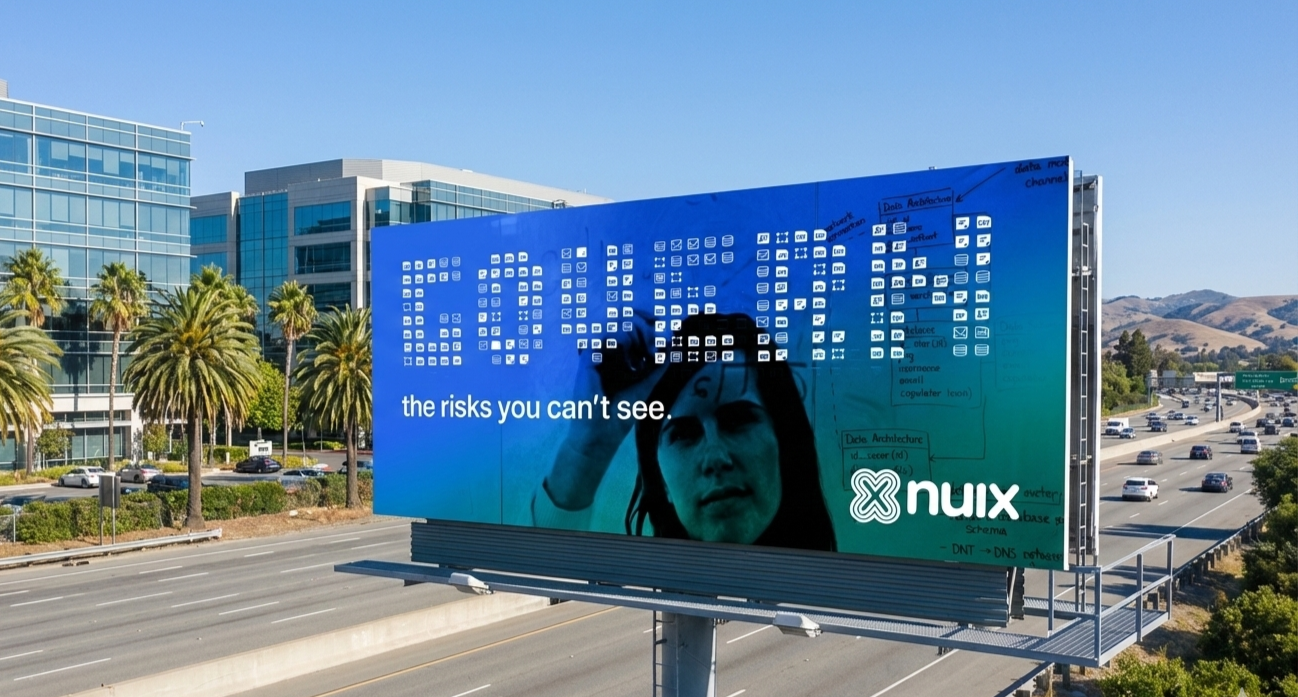
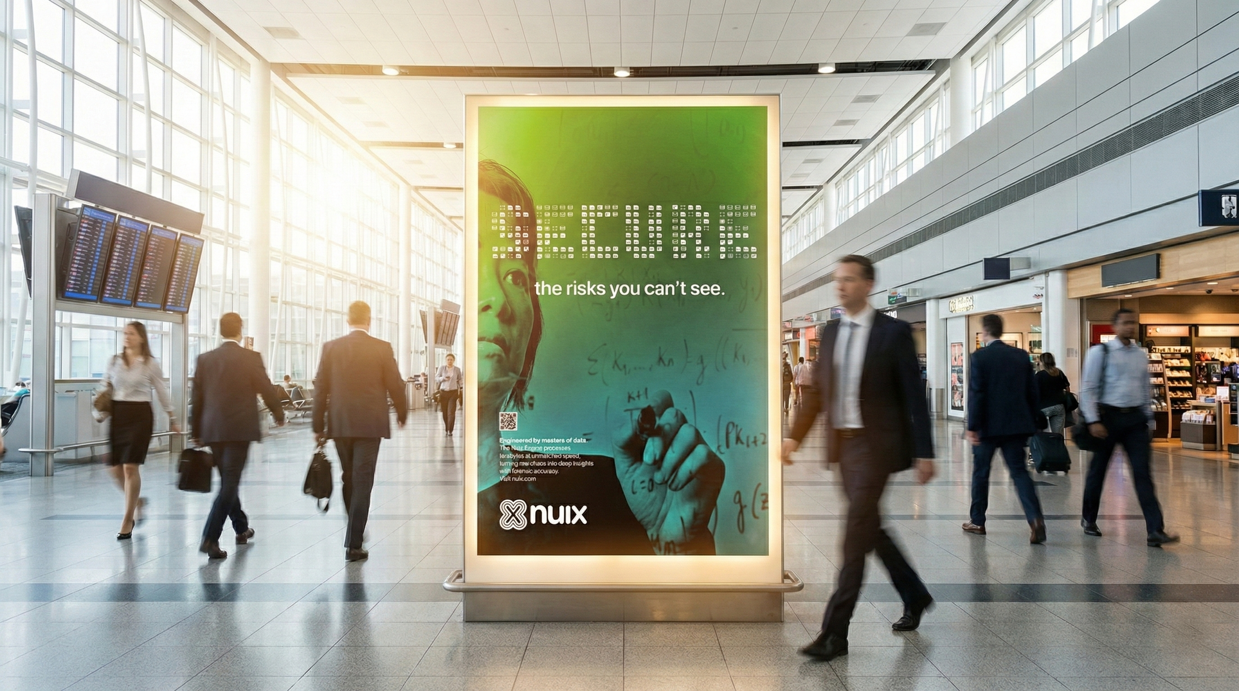
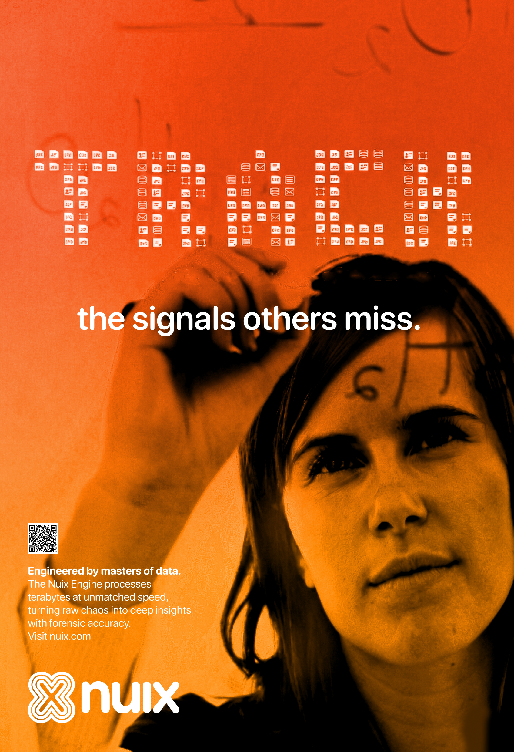
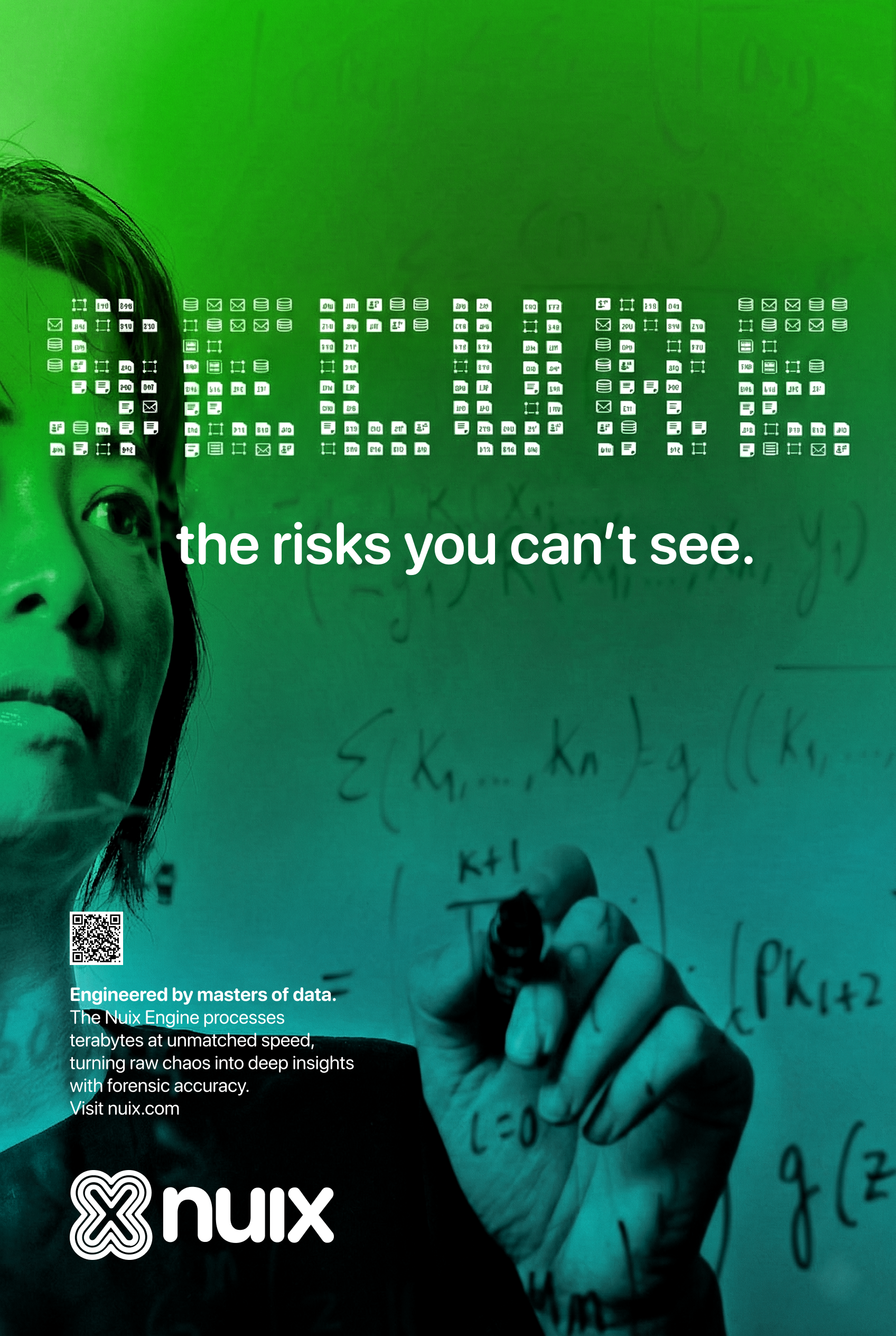
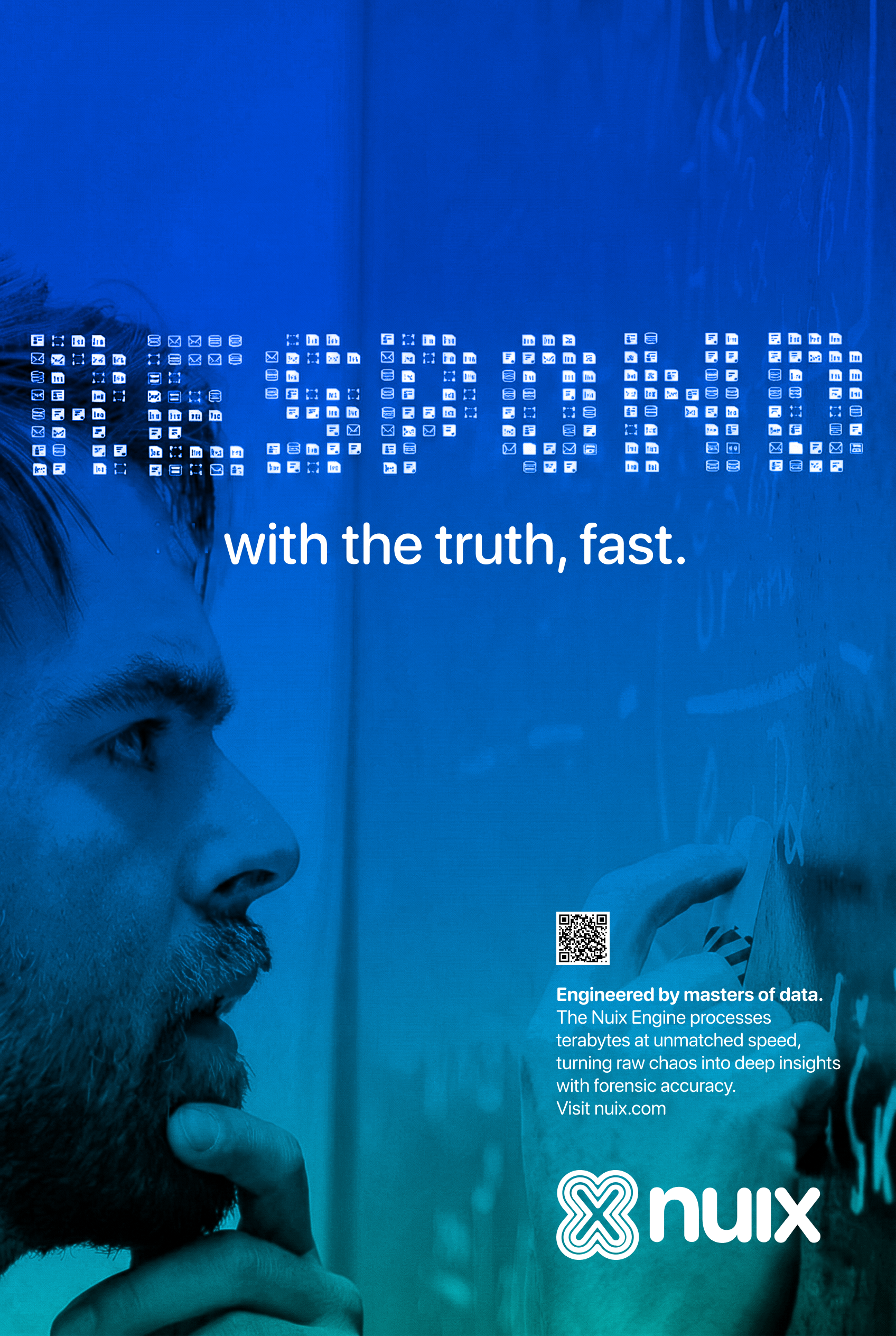
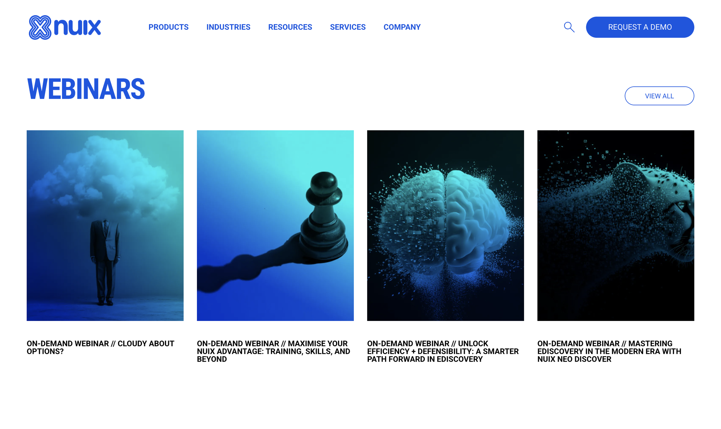
The Campaign: Data Pointillism
The campaign acts as the "Field," where complexity is discovered. We introduced a visual language called "Data Pointillism." Instead of using decorative magic, we used the raw structure of file icons (xls, jpg, mov) to build narrative typography and shapes.
Strategic Tension: We paired photography of intense experts with these Data Pointillism overlays. This created a high-concept tension: the human expert (the Sage) interacting with the raw digital DNA.
The Deciphering Act: While the UI provides immediate clarity, the campaign imagery requires the viewer to "decode" the icons. This active engagement signals to C-suite buyers that Nuix doesn't just simplify data, it masters it.
Results
The rebrand successfully shifted Nuix from a participant to a leader, delivering measurable gains across every metric:
Happiness (Perception): Analyst recognition moved from "Contender" to "Market Leader."
Engagement: 15% increase in average time on page and a 198% increase in unique views.
Adoption: 22% increase in direct branded search traffic following targeted airport and OOH campaigns.
Task Success: 30% increase in closing sales and an 18% lift in new enterprise leads specifically citing the OOH campaign.
Reflection
The success of the Nuix transformation came from embracing complexity rather than running from it. By contrasting the clinical precision of the Nuix Neo UI with the "Data Pointillism" of the campaign, we created a brand that feels both technically superior and intellectually engaging. We proved that in a world of "category drift," radical truth is the most powerful brand lever.
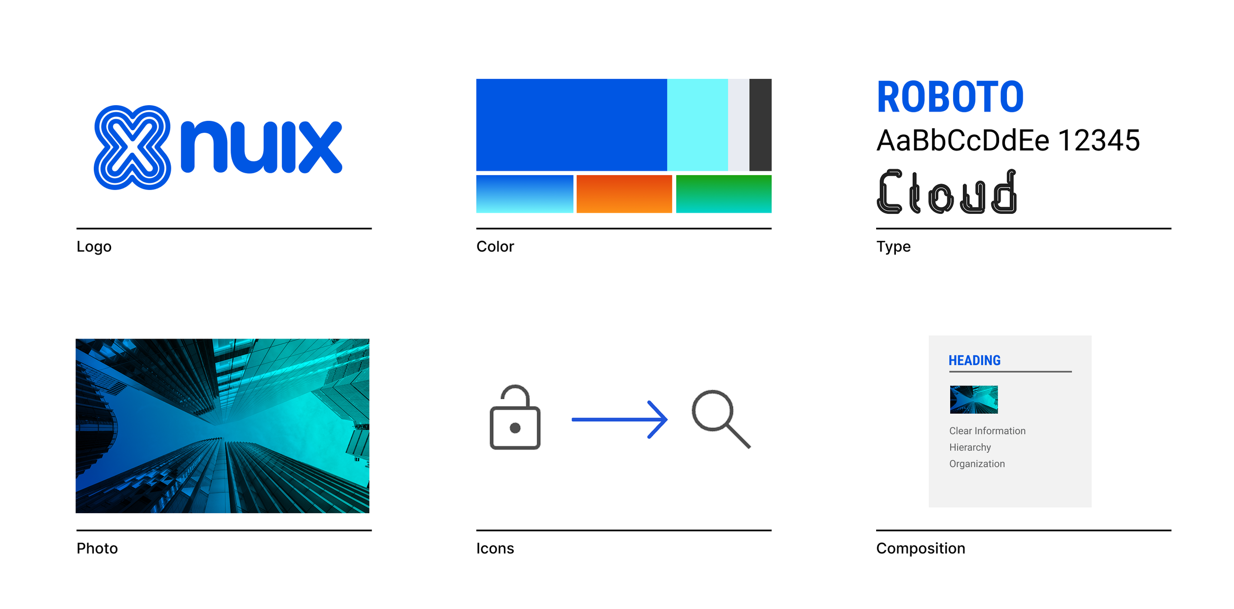
We built a rigorous visual system rooted in clarity. The toolkit features a custom typeface derived from the identity’s geometry, extending the brand equity into every headline. Minimal icons and organized compositions act as a "bento box" for information, bringing structure to the chaos of digital files.