Type+
Image
Year: 1992
Ontario College of Art & Design.
Communication Design.
Alex Alter Professor
Vermeer employed a structured approach to composition, despite the organic nature of his luminous realism. Using “Woman with a Water Jug” (1662) by the Dutch painter Johannes Vermeer, I revealed the grids and underlying golden sections he used. From here I explored ways to utilize the proportions and created a poster design for Alvin Toffler Futurist Speaking event.


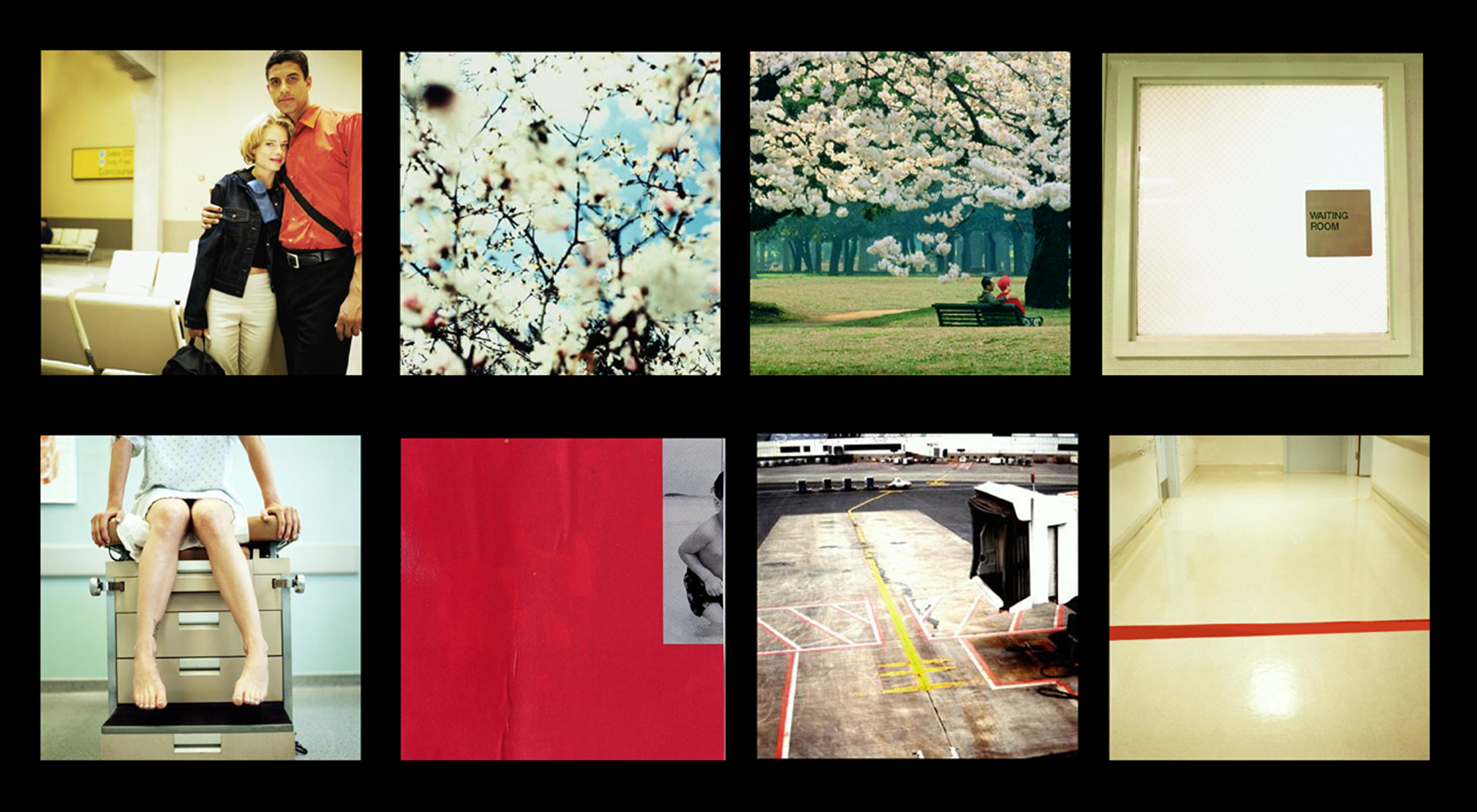
Semiotic image
The project began with random magazine images. A woman in red and sepia sparked a narrative of longing—for love, for a child. This intuition guided the next selections, forming themes like “looking,” “memory,” and “holding” as expressions of hope.
I then arranged all the images into a continuous sequence, allowing a new narrative to surface through their evolving relationships.
This stage distilled the story into four images, using only graphic elements to convey the narrative.
Finally, I reinterpreted the images through the conceptual filter of “mystical” aesthetics, transforming their tone and symbolism.
Year: 1998
RISD Semiotics Graphic Design
SIGDS WORKSHOP
with Thomas Ockerse
Unfolding Meaning
This is a visual storytelling project rooted in semiotic theory. Using a structured process, I explored how meaning shifts through image sequencing, substitution, and reinterpretation. What began with random magazine clippings evolved into a layered study of signs and signifiers—how visual codes shape narrative, perception, and understanding. The project functions as both an experimental art piece and a critical investigation into the mechanics of meaning-making.


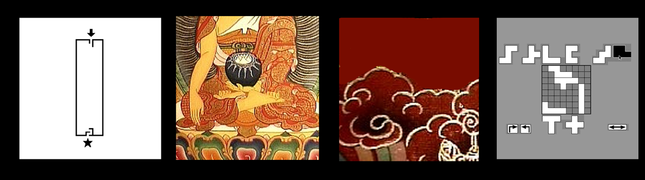
Poster Design
Random cutting of square images from magazine pages. Then arranged in a configuration that felt pleasing.
Adding figurative elements, various explorations.
I leaned into the architectural blue tones to connect to the subject and intended meaning of the event.
Year: 1999
RISD Graphic Design
SIGDS WORKSHOP
Nancy Skolos & Tom Wedell
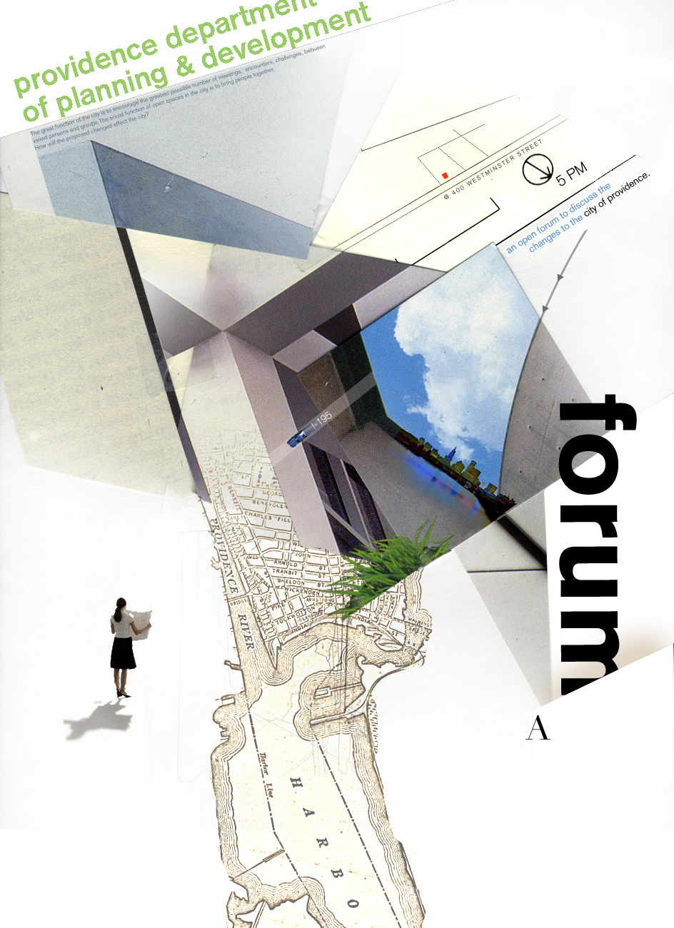
Nancy Skolos and Tom Wedell’s poster class shows how language becomes a system: pure form first, meaning only after the form collides with context, say, a city planning event. I borrowed that method in class. I sliced architectural fragments into collages, chasing spatial play until an unconventional, layered poster surfaced. Only then did I pour in content, letting context snap the abstract into practical use — this could be a poster for a community planning event. Why it works? It nudges viewers to see familiar spaces from a fresher, deeper angle. This would set the tone for a dynamic community engagement.


Poster Design
Year: 1999
RISD Graphic Design
SIGDS WORKSHOP
Designed an event poster for Swiss band Stimhorn’s album Schnee (Snow), inspired by the music’s origins in the Swiss Alps. The design draws from the angular forms of the mountain landscape and the structural features of the accordion, a central instrument in their sound. A paper mechanism photo was incorporated as a visual device, echoing both the tactile quality of the instrument and the alpine geometry—creating a cohesive visual language rooted in place and sound.


