Designing Meaning: Crafting Brand Experience Across the Senses

Semiotics, the study of signs and symbols, is a silent dialogue between a design and its viewer. Designers use cues like shapes, colors, and icons to communicate complex ideas instantly. A sign represents something beyond itself, carrying meaning by resemblance or convention. The golden arches of McDonald’s or the Nike swoosh aren’t just logos, they evoke associations and emotions. These signs span beyond visuals. Signs can appear in images, sounds, and textures. Branding today is multi-sensory, where sound, motion, touch, and space serve as signifiers. Understanding semiotics allows designers to create richer, more resonant brand experiences.
Brands act as systems of signs. Logos, colors, animations, sounds, and even scents work together to tell a bigger story. Let’s look at how modern design applies this language across the senses.
Multimodal Semiotics in Action
Brands today engage not just visually but through sound, motion, touch, and immersive environments. These elements act as signs that create a holistic brand language.
Visual Design – Signs in Sight
Vision is the first doorway to meaning. A single curve, a chosen hue, a letterform’s stance, each whispers a story before a word is read. Coca-Cola’s red floods the eye with warmth and sociability, while Tiffany’s blue signals rarity and ritual. Shapes speak too. Mastercard’s overlapping circles promise connection. The hidden arrow in FedEx unlocks a wink of momentum. Even white space is a sign, inviting a breath of clarity.
Crafting a visual code is less about ornament, more about orchestration. Contrast, hierarchy, and rhythm guide attention like a conductor leading strings and brass. Serif or sans, sharp or rounded corners, ink-heavy or airy grids, every choice cues emotion. When a brand owns its palette, form language, and compositional cadence, viewers do not just see design, they feel intention.
The invitation for designers is to treat sight as a living alphabet. Ask what the eye learns in a first glance, what tone color and contour together recite, how motion or sound will later harmonize with these opening notes. A well-tuned visual system sets the key for the multi-sensory symphony, ensuring each subsequent signal arrives in concert and the entire brand score resolves, unforgettable.

Tiffany
The iconic Tiffany Blue box is a master-class in instant semiotic recognition. Its robin-egg hue, squared shoulders, and crisp white ribbon telegraph rarity and ritual long before the lid lifts. One glance and consumers pre-load expectations of luxury, intimacy, and legacy. The eye meets the code, the code cues the feeling, and the brand wins the heartbeat.
Sonic Branding – The Signs of Sound
A sonic logo can be as powerful as a visual one. Netflix’s "ta-dum" is instantly recognizable, achieving over 80% brand recall. Brands like Leffe have developed sonic identities, drawing from their heritage to create meaningful soundscapes. Leffe’s sonic palette includes organ tones, chants, and bells—evoking monastic roots and craftsmanship. These sonic signs reach beyond screens to voice assistants, stores, and radio.
More brands are adopting sound to enhance recall and consistency. Standard Chartered launched a full sonic identity, Grab created a distinct notification sound, and Lux uses music to reflect brand values. Sound carries emotion, major vs. minor chords, high vs. low tones, each triggering specific feelings. Sonic branding turns audio into symbolic brand language.
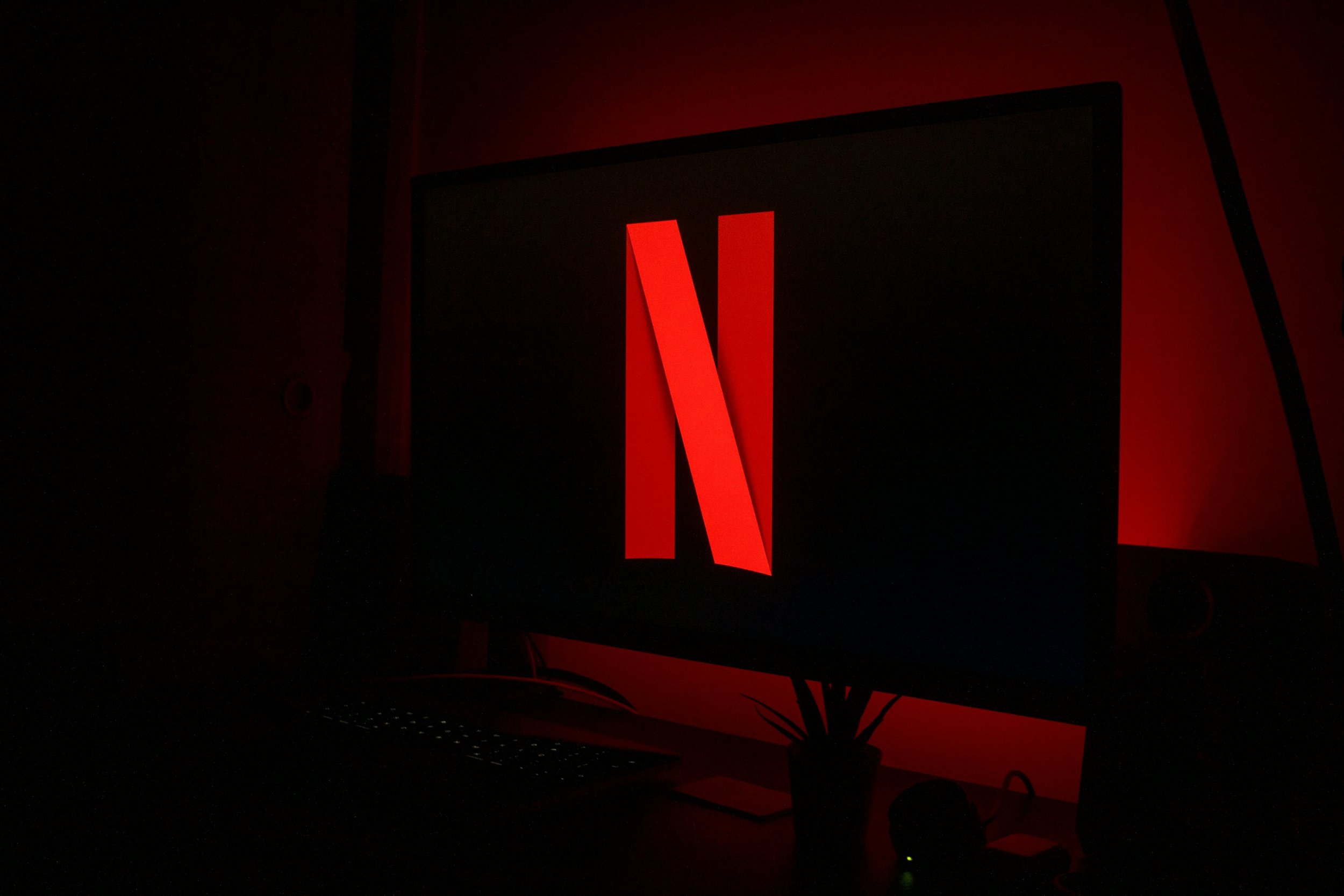
Netflix
Netflix’s two-note “ta-dum” works like Pavlov’s bell for binge culture. Less than half a second, yet it summons couches, popcorn, and endless scroll nights with >80 % recall. That micro-crescendo is an audible logo: major interval for uplift, sub-bass hit for cinematic gravitas, a neatly wrapped story in stereo.
Motion Design – Signs That Move
Motion gives signs behavior. A gentle animation may signal calmness, while a bouncy one conveys energy. A&W’s brand refresh used snappy retro motion to evoke nostalgia and fun. ComediHa! created a mascot that laughs and bounces, embodying humor. These movements become indexical signs—pointing to feelings without using words.
Google Cloud’s motion identity, designed for its 2023 event, conveyed adaptability. Animations like sharpening focus or fluid transformations embodied themes like "responsive" or "wabi-sabi." Motion is now treated like color or typography—a critical part of brand language. Teams ask: How does our brand move? Each movement carries semiotic weight.
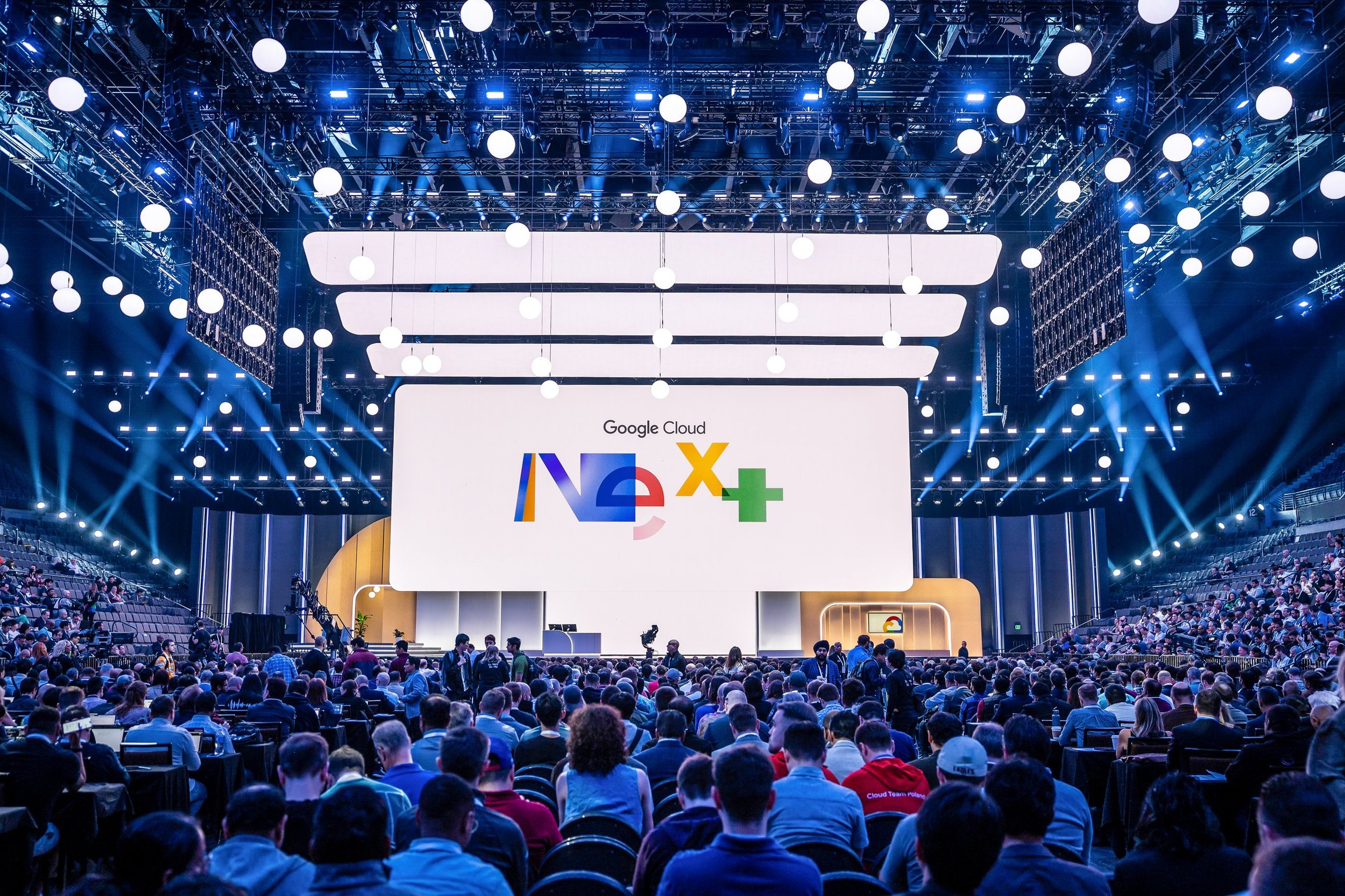
Google Cloud
Google Cloud’s Next identity pivots, slides, and re-assembles its primary-color fragments to whisper “adaptive, modular, endlessly scalable.” Each easing curve and overshoot is deliberate grammar: sharp snaps for precision, elastic rebounds for resilience. Motion here isn’t decoration, it’s a verb that teaches the product’s personality.
Haptic Feedback – Touch as Signal
Touch is a subtle but powerful channel. Vibrations can signal success, alerts, or urgency. Apple Pay’s buzz tells users a transaction went through. These are learned signs, just like icons or sounds.
Haptic design can deepen engagement. A Stoli vodka ad simulated a cocktail shaker through vibration. Volkswagen used phone vibration to mimic an engine rev. These tactile signals bridge the digital-physical gap, making brand experiences feel real. Research shows touch cues increase recall and emotional impact. A well-designed buzz can feel like the device "taps you on the shoulder." Haptics may soon become as iconic as sound.
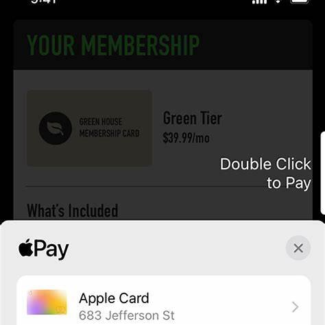
Apple Pay
The gentle double-tap of Apple Pay is a pocket-sized handshake: “payment accepted, you’re good.” Users learn the buzz as surely as they learn a traffic light. Tactile confirmation trims cognitive load, builds trust, and slips seamlessly into muscle memory. Vibration becomes an indexical sign—your phone literally nods back.
Immersive Spatial Experiences – Signs in Space
Brands are building immersive worlds, both physical and virtual. Alo Yoga’s virtual showroom let users explore, mix outfits, and meditate. Every design element, the layout, sounds, interaction, signified Alo’s wellness-focused identity. Users spent more time and showed stronger recall.
Others are doing the same. e.l.f. built a luxe virtual lounge. Swarovski created a digital flagship with a gamified scavenger hunt. These environments speak in sign systems. Apple Stores, too, use layout, sound, scent, and materials to signify simplicity and innovation. Mixed reality adds another layer: a shoe might gain virtual flames when viewed through a phone, a sign for performance or style.
When all senses work together, brand messaging becomes experiential. Immersive design moves semiotics from concept to lived story.

Alo
Alo Yoga’s Roblox showroom bathes visitors in soft wood, skylight beams, and guided-meditation audio, translating wellness codes into pixels. Browsers linger, try on virtual gear, and exhale into a calming digital sanctum that mirrors studio vibes IRL. Space morphs into story, and the brand’s ethos becomes somewhere you can stand.
Semiotics in design has moved beyond the visual. Today, it is a symphony. Logos carry motifs. Sonic tags add melody. Motion provides rhythm. Haptics add feel. Spaces become immersive instruments. Designers must compose these elements into harmony. The result? A brand you don’t just see. You hear it, feel it, remember it. A brand that speaks fluently across senses.
Implications – Designing for the Full Sensorium
With access to sound, motion, touch, and space, designers must orchestrate coherence. A whimsical brand can have playful motion and music. A wellness brand might use calm colors, gentle haptics, and ambient sound. Inconsistencies, like a luxury visual paired with a goofy sound, disrupt meaning.
Designers also need cultural sensitivity. Meanings shift across regions. A sound seen as calming in one place may be grating elsewhere. Touch patterns may mean different things. Research is key. Ethics matter too. Immersive tools shouldn’t manipulate or overwhelm. Haptics should support accessibility. A good rule: enhance connection, not distraction. Thoughtful multi-sensory design builds belonging.
Glossary of Key Semiotic Terms
Sign: A basic unit of meaning (word, image, sound) made of a signifier (form) and signified (concept). A red rose might signify romance.
Symbol: A learned sign, with no inherent link to its meaning. Logos, words, and the heart shape are symbolic.
Icon: A sign that resembles what it represents. A camera icon implies photography. Icons feel intuitive across cultures.
Index: A sign linked by cause or association. Smoke signals fire. A loading spinner signals processing.
Code: A system of rules shaping how signs are interpreted. Minimalist design might code as "luxury." Designers often rely on or subvert codes to build meaning.