ABC
Year: 1997
Agency: Hatmaker
Project: ABC Network Visual Identity Design System
As part of a re-branding project ABC was looking to evolve their on-air and off-air brand identity from the current prime-time yellow campaign and to draw consistently into other day parts of the channel. My idea was do use the logo “meatball” as the visual device that ties all the parts of the channel. The solution was to base the look and feel identity on the dot and flat color, which is the root of their prime-time look. The design system included day part color coding, designing a graphic architecture, and a typographic system that brands the show and the talent to the network. The package production was taken care of Pittard Sullivan. The visual branding system extended to television, web, and print.


BET
Year: 2003
Agency: Hatmaker
Role: Design director
Brand identity expression system rooted in elements from the identity. Collaborated with design intern Ben Powell, his father Earl was the head of the Design Management Institute (DMI) in Boston during the 1990s. (files not found, low rez preview only)


Oxygen
Year: 2002
Agency: Hatmaker
Role: Design Director, Designer, with Tom, Marianna, and team!
Brand and visual identity for a new women’s channel. I designed the logo that revealed itself with the interplay between of the foreground and background. The logo was not a single image, but a moving expression of the brand. It was a refreshing collection of programming that elevated women, perfect fit. The brand was led by Linda Ong, a pioneer in cultural branding and insights.


The challenge was to develop an identity that reflected the refreshing and evolving nature of the brand. The identity needed to be unconventional to standout from other women networks. The result was flexible system that was characterized by a constantly moving graphic that reflected its energy and life force of oxygen. The identity was translated across print, web and television. Having an established relationship with the Director of On-Screen, this allowed us to extend our expertise to on-air promotions. My team was commissioned to design and produce a series of logo id’s and 14 interstitial spots for the launch of the channel. As a director and designer, I was responsible for directing the scripts, design, animation, music and sound design. The identity and spots were recently received awards from AIGA, and BDA/Promax.
Warner
Year: 2004
Agency: Hatmaker
Role: Designer
Tom, Marianna, Marko and team!
Menu design template for Latin American Warner Brothers Channel programming 5 second end tags. Show opening for Warner’s movie channel. This segment were “classic” films so I used an accessible retro style treatment.


Duracell
Year: 2004
Agency: Arnold Worldwide
Role: Art Director/Designer
Outdoor campaign concepts. Bold, fast, low cognitive load since you only have 5 seconds. Visually say the device is using Duracell batteries without saying it with a logo. I thought the solution was elegant and functional like the brand, I thought it would be an incredible hit. Unfortunately, it wasn’t “creative” enough, so it got shelved. lol

Upromise
Year: 2000
Role: Designer
(Created while employed at Corey & Company / Hatmaker)
I designed this iconic brand under the talented CD Michael McPherson at CMN Design, Boston. The strategy was focused on their name which wasn’t about college savings. So we created the visual of U and college with a promise. The mortar board was an easy icon to represent at 16px square.

Persona
& Journey
Year: 2005
Agency: Razorfish
Role: Research assistant, Designer.
Mapping our thinking as we developed user experiences for some of the first digital interfaces. These frameworks are instrumental and foundational to the work we did at Razorfish. This was used to design a hotel website experience.


TV Pilots
Year: 2008-2015
Agency: Powderhouse
Role: Freelance Creative
Collaborated with Powderhouse’s writers and producers to turn show concepts into compelling rich pitch packages—designing logos, storyboards, and visual treatments that brought each series to life for executives at every major TV network, including Discovery Channel and NatGeo.


Mood
Interfaces
Year: 2005
Agency: Razorfish
Role: Designer
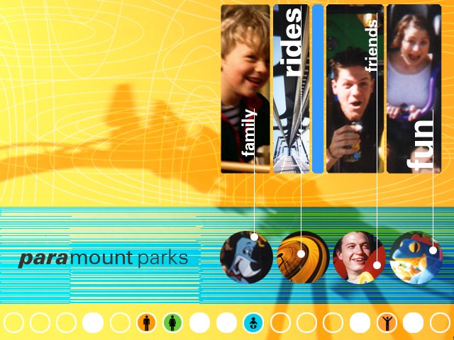
Moodboards in the design strategy phase of work. I developed these for Audi (Automotive), Springer Verlag (Life Sciences), and Cedar Fair Entertainment Co. (Entertainment) clients.


Declare
Year: 2000
Agency: Hatmaker
Role: Design Director
Expressing my values as a creative leader.
